DESIGN.md examples
Real DESIGN.md files extracted from public websites. Each one captures a site’s colors, typography, spacing, and components in the format AI coding agents read. Open a card to preview it and copy it into your repo.
Extracted from each site’s public pages, not official brand guidelines. New to the format? Read what a DESIGN.md is.
Airbnb
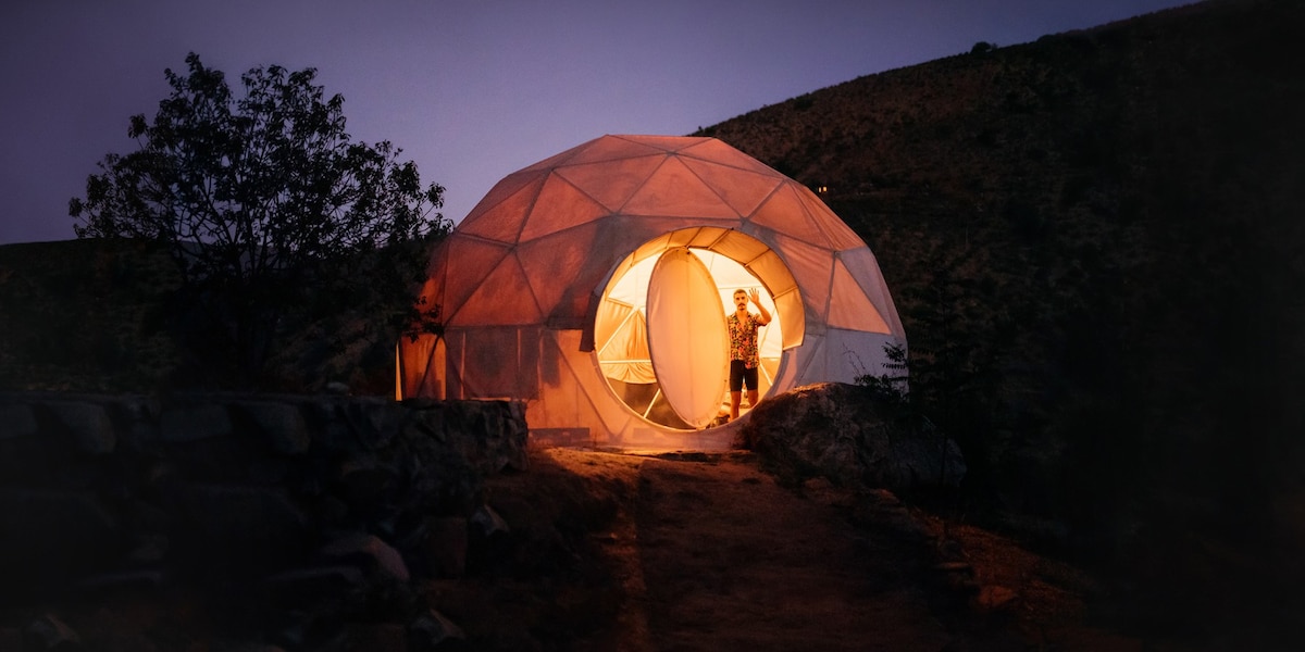
Airbnb's design system is built around a single proprietary variable font (Airbnb Cereal VF), a near-monochrome neutral palette anchored by deep charcoal (#222222) and light grays, with the brand's signature "Rausch" coral-pink (#ff385c) reserved exclusively for primary CTAs and the logo. The layout is a responsive photo-card grid with generous image-to-text ratios, soft 20px rounded corners on cards, and a multi-layer ambient shadow system that creates subtle depth without harsh contrast. The search bar is a prominent pill-shaped container that unifies the core user action.

Anthropic
Anthropic's design system is a restrained, typographically-led identity built around two custom typefaces — Anthropic Serif and Anthropic Sans — set against a warm ivory background (#faf9f5). The palette is deliberately minimal: near-black (#141413) on warm off-white, with muted stone tones for secondary text and borders. Large-scale serif display type anchors the editorial voice, while a dark-panel section (near-black background with ivory text) creates dramatic contrast. The overall aesthetic communicates intellectual seriousness and safety-first mission through generous whitespace, high typographic contrast, and zero decorative ornamentation.
Apple
Design tokens extracted from CSSOM frequency analysis without LLM interpretation.
Dribbble
Dribbble's design system is built on a deep near-black navy (#0d0c22) paired with a crisp white surface, punctuated by a signature hot-pink (#ea4c89) accent used sparingly for editorial emphasis and interactive highlights. The entire typographic system relies exclusively on Mona Sans across all weights, creating hierarchy through weight and size alone. Pill-shaped buttons (border-radius: 1e+07px) and rounded cards (12px radius) define the geometry language. The layout is spacious with an 8px base grid, and elevation is conveyed through subtle drop shadows rather than heavy layering.
Duolingo - The world’s most popular way to learn
Design tokens extracted from CSSOM frequency analysis without LLM interpretation.
Figma
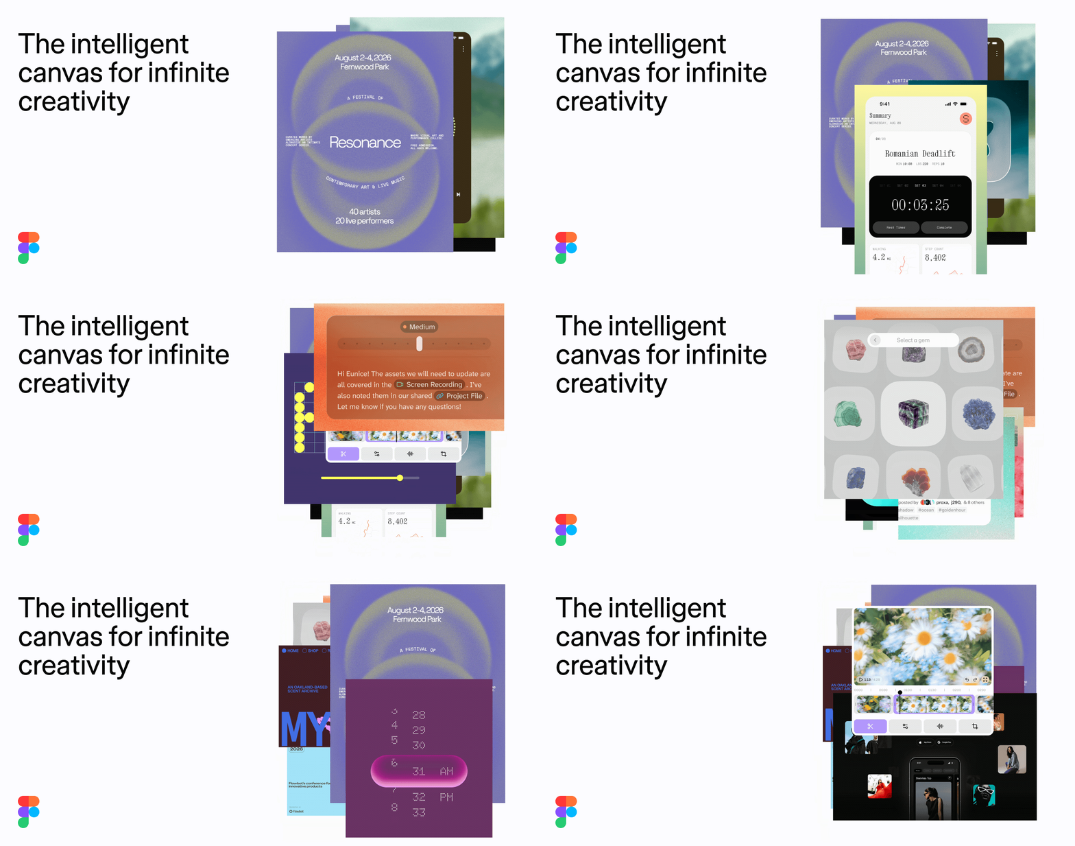
Figma's marketing site uses a stark black-and-white monochrome system anchored by its proprietary figmaSans variable font. The design is typographically driven — large display headings at 88px/56px with tight negative letter-spacing contrast against lightweight body copy at weight 330. CTAs use fully-rounded pill shapes (border-radius: 9999px) in solid black with white text. The layout is grid-based with a 1440px max-content width, generous 80px vertical section padding, and a clean white canvas. Depth is minimal — shadows are subtle oklch-based overlays. A lavender/purple accent (#cb9fd2) appears in the footer banner. The overall aesthetic is confident, typographically sophisticated, and brand-forward.
Harvey
Harvey's design system is built around a bespoke dual-typeface identity — HarveySerifFont for editorial authority and HarveySansFont for functional clarity — set against a warm near-black (#0f0e0d) navigation bar and an off-white ivory (#fafaf9) content surface. The palette is deliberately monochromatic, using a graduated warm gray scale (gray-50 through gray-950) with no accent hues, signaling trust and restraint appropriate for high-stakes legal work. Elevation is conveyed through surface contrast rather than shadows. The hero headline uses a large serif at 72px, creating immediate typographic authority, while body copy and UI elements use the custom sans. Spacing follows an 8px base grid with named scale tokens (xs, sm, md, xl, 2xl).
IKEA
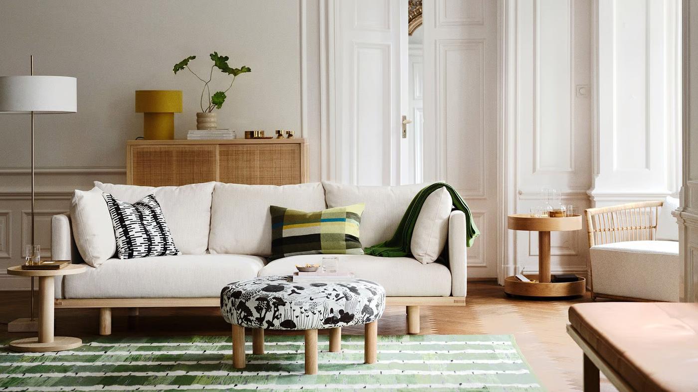
IKEA's global homepage uses a bold, flat design system anchored by the iconic IKEA Yellow (#ffdb00) as the primary action surface and IKEA Blue (#0058a3) as the brand logo accent. The entire typographic system is built on a single custom typeface — Noto IKEA — spanning weights 400 and 700 across a tightly defined scale from 14px body text to 51px display headings. Elevation is conveyed entirely through color contrast and layout structure rather than shadows. The layout uses a max-width container of 90rem with a 1.5rem desktop grid gap, and a consistent 8px border-radius token applied to interactive elements. The off-white background (#fffefb) provides warmth against the stark #111111 text, creating a high-contrast, accessible reading experience.
Klarna
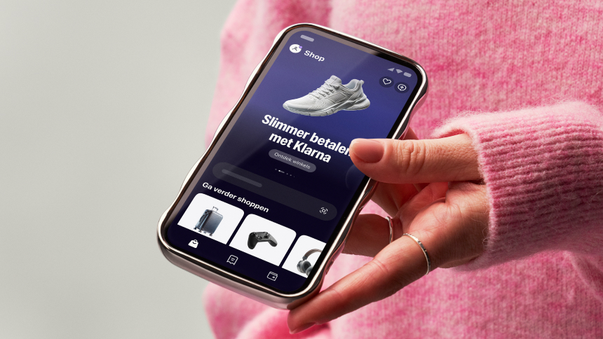
Klarna's design system features a sophisticated dark navy primary color (#0b051d) with bright accent colors including their signature pink (#ffa8cd). The system uses custom Klarna fonts alongside system fonts, emphasizes rounded corners (32px being most common), and maintains high contrast for accessibility. The design balances professionalism with approachability through generous spacing and clear typography hierarchy.
Linear
Linear's design system is a dark-first, high-density product UI built for engineering teams. The surface palette anchors on near-black (#08090a, #0f1011) with layered dark grays for sidebar, card, and panel differentiation. Typography is exclusively Inter Variable with precise negative letter-spacing at display sizes and Berkeley Mono for inline code. The radius language is deliberately small (2–6px dominant) with pill shapes reserved for badges and status chips. Elevation is expressed through subtle 1px inset borders and low-opacity drop shadows rather than dramatic layering. The primary CTA color is Linear's signature indigo (#5e6ad2), used on the Sign Up button and key links.
Magentix Studio
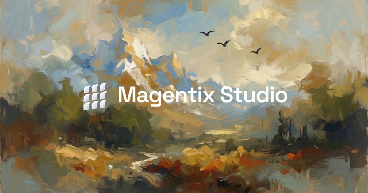
Magentix Studio dresses an AI-first product studio in editorial, art-gallery clothing. The personality is calm and craft-driven: oversized Fraunces serif headlines (often with italic accents like *come together* and *Say hello.*) sit over warm off-white surfaces, while muted sans
Neon
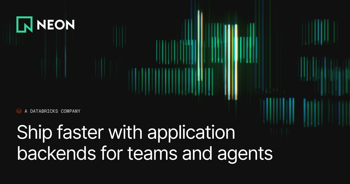
Neon's design system is a dark-first developer brand built on a near-black canvas (#000000, #18191b) with a vivid neon-green primary (#00e599) and a supporting mid-green (#34d59a). The typographic system pairs Inter (UI/body) with GeistMono (code/data), both with tight negative letter-spacing. Spacing follows a 4px base grid. Border radius is uniformly minimal at 4px. Elevation is achieved through border contrast rather than shadows, with a single ambient drop-shadow used sparingly. The hero section features a full-bleed animated data-visualization background, reinforcing the database/infrastructure brand identity.
Notion
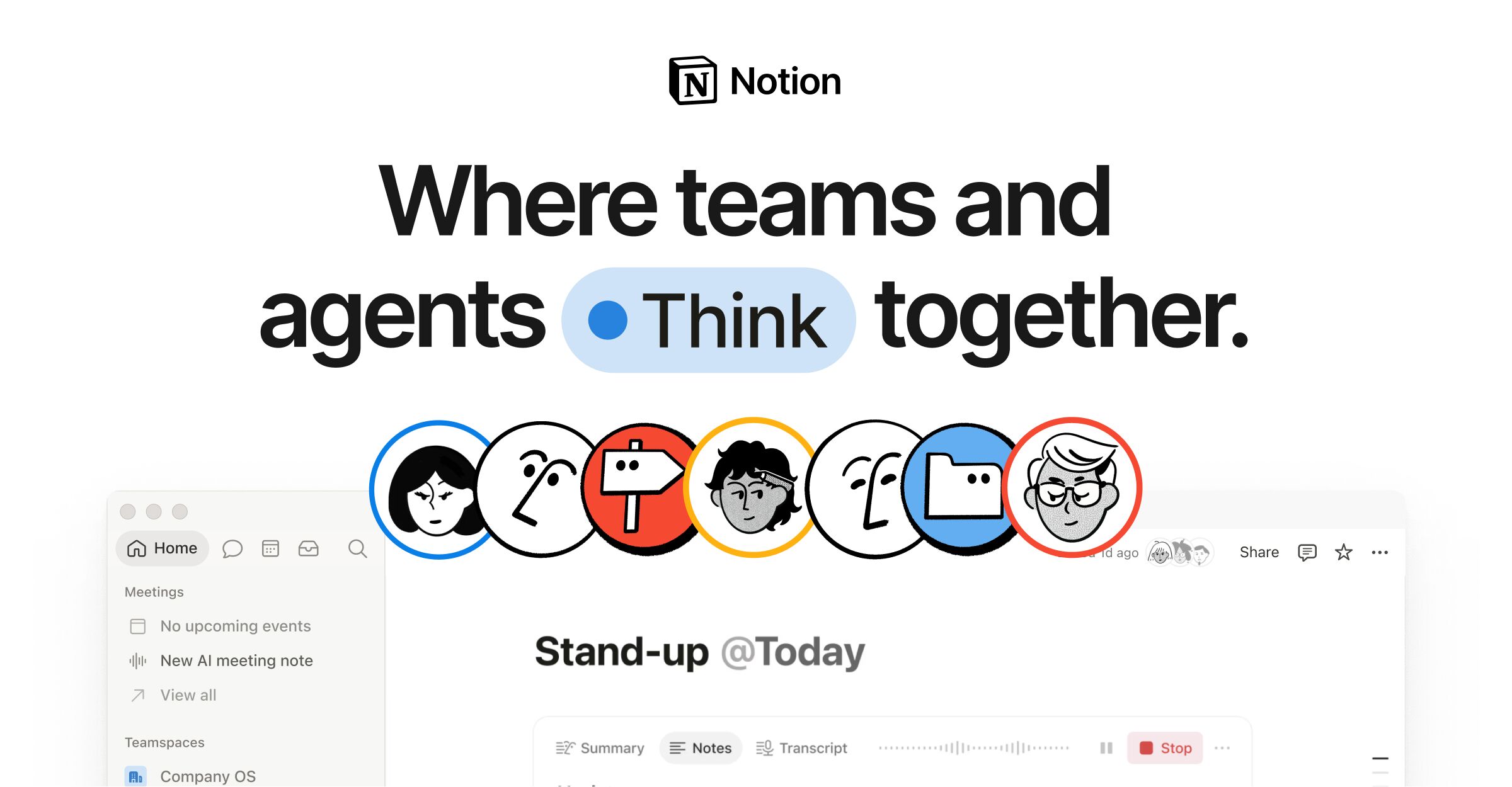
Notion's marketing homepage pairs a deep navy (#02093a) hero section with a light (#f6f5f4) body, using a custom typeface (NotionInter) across all text roles. The design employs a 12-column grid with 28px gutters, a dual-radius language (8px for cards, 9999px for pills), and a multi-layer progressive shadow system for floating UI elements. Brand blue (#2537b1) drives CTAs and accent highlights, while a semantic gray-scale ladder (gray-200 through gray-900) structures all text and surface hierarchy.
Paperclip
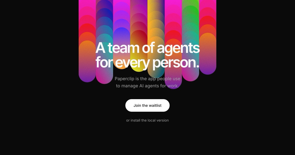
Paperclip is an AI agent management platform with a bold dark-canvas design anchored by a near-black (#0a0a0a) background and white (#ffffff) foreground text. The hero is defined by a vivid multi-color gradient illustration of stacked pill/capsule shapes in magenta, violet, teal, orange, and yellow — creating a chromatic, energetic visual identity against the dark field. Typography pairs Inter Tight (condensed, heavy headlines with negative letter-spacing) with Inter (body/UI) and JetBrains Mono (code/status). The primary CTA uses a white pill-shaped button on dark background. A semantic green (#22c55e) status system signals agent and task states throughout the product UI. Navigation is minimal and flat with a subtle bottom border.
PayPal
PayPal's Dutch homepage uses a bold, consumer-facing design anchored by a vivid sky-blue (#60cdff) hero section with ultra-heavy black display typography (PayPal Pro w900). The navigation is white with black text and two distinct CTA buttons — an outlined "Inloggen" and a filled black "Rekening openen". A dark navy announcement banner sits at the top. The overall language is high-contrast, pill-radius-heavy, and brand-typeface-driven, projecting trust and accessibility for a broad consumer finance audience.
Railway
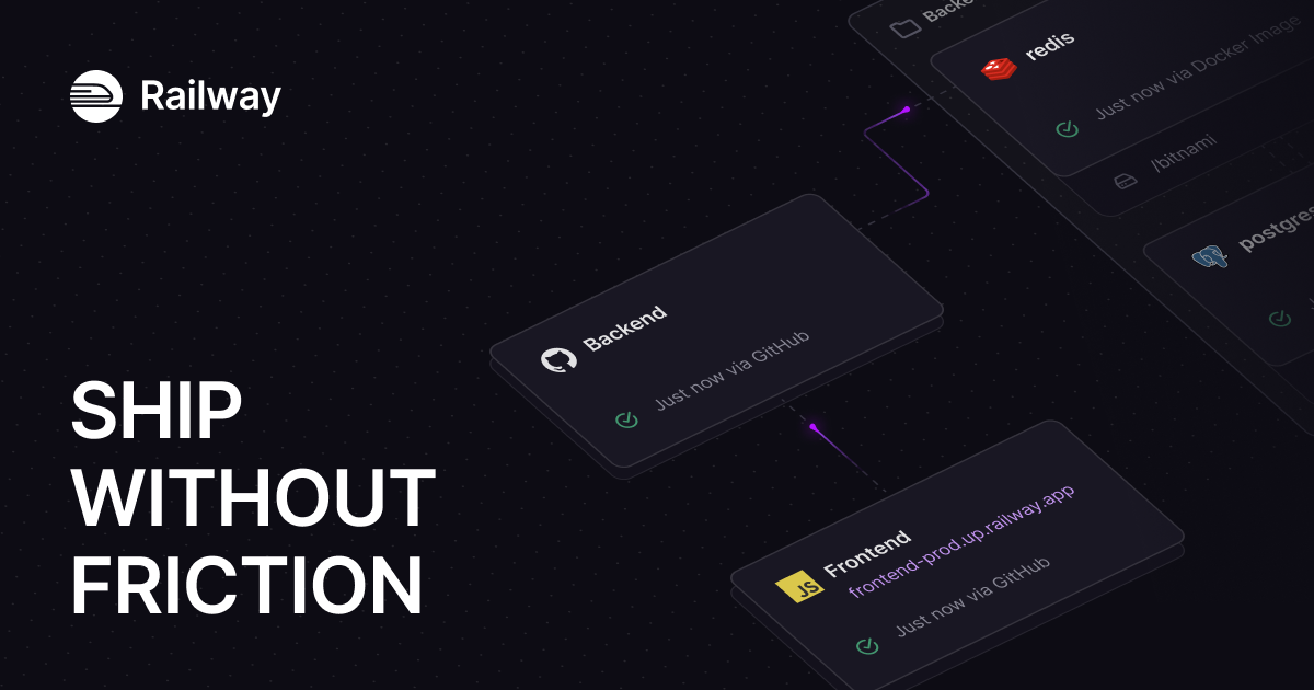
Railway's design system is a dark-first developer platform UI anchored in deep near-black navy surfaces (#13111c, #0b0b0f), high-contrast off-white text (#f7f7f8), and a distinctive purple brand accent (#853bce / #553f83). The hero uses IBM Plex Serif for editorial weight, while Inter handles all UI copy and JetBrains Mono / SF Mono serve code contexts. Elevation is achieved through inset white-glow borders (rgba(255,255,255,0.2) 1.5px inset) rather than drop shadows, giving the UI a glass-panel aesthetic. The spacing system is 4px-based with a strong 8/12/16/24/32 rhythm. Border radii are tight (4px dominant) with selective 8px and 16px for cards and hero containers.

Shopify
Shopify's marketing homepage uses a dramatic full-bleed video hero with a near-black (#02090a) background that contrasts sharply with the white navigation bar above. The primary brand accent is a vivid mint green (#36f4a4) used sparingly for highlights and interactive states. Typography is split between NeueHaasGrotesk for display/editorial headings and Inter-Variable for UI body copy. CTAs use fully-rounded pill shapes (border-radius: 9999px). The overall system is confident, high-contrast, and aspirational — built to convert visitors into merchants.

Snapchat
Snapchat's web presence uses a high-contrast light theme anchored by its iconic #FFFC00 brand yellow, near-black (#121314) primary surfaces, and a clean white page background. The design pairs Avenir Next (primary) with Graphik (secondary) for a friendly yet structured typographic hierarchy. Interaction elements — buttons, pills, and tags — use fully rounded (100px) radii, while inputs use a subtle 5px radius. Navigation is a floating pill with a soft drop shadow. Content is presented in large media cards with overlaid white text, creating an immersive, app-preview-forward layout. The overall density is moderate, with generous spacing and a clear visual hierarchy that bridges marketing and product UI conventions.
Stripe
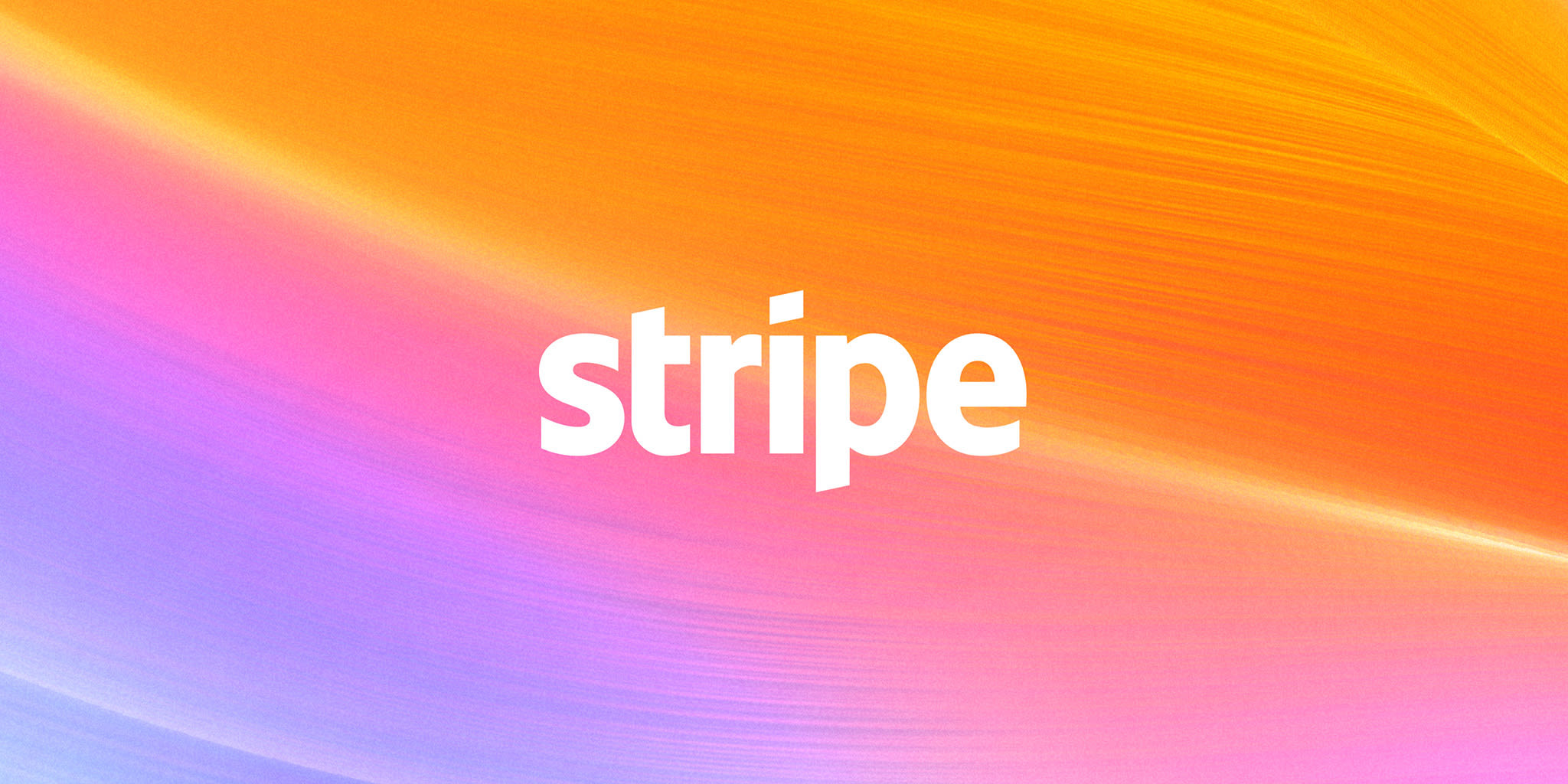
Stripe's marketing homepage uses a tightly controlled design system (HDS — Stripe Design System) built around the variable font "sohne-var" at light weights (300–400), a deep navy-to-indigo brand palette anchored by #533afd (Stripe Indigo), and a signature full-bleed spectral gradient hero. Components are low-radius (4–6px), flat-to-minimal-shadow, and structured around an 8px base spacing grid. The overall tone is authoritative yet approachable — financial infrastructure communicated through confident typography and restrained color use.
Supabase
Supabase uses a dark-first design system anchored by a deep near-black background (oklch ~0.19) with a vivid green brand accent (#3ecf8e / #3fcf8e). The layout is structured around a responsive feature card grid, with Manrope for display headings and Inter for body/UI text. Source Code Pro handles all monospace/code contexts. The color system is built on oklch custom properties with semantic naming. Cards use 12px radius with subtle border treatment, buttons use 6–8px radius, and the overall density is moderate with an 8px base spacing grid.
The Onion
The Onion's design system is a digitized satirical newspaper: bold condensed gothic headlines in black, a distinctive forest-green (#006b3a) brand accent used for section labels, trending badges, and CTAs, all set against a stark white/light-gray canvas. Typography is the primary design tool — Adobe Fonts condensed and semi-condensed grotesques (tablet-gothic, rocky-condensed) dominate headlines while utopia-std-caption handles body copy. The layout is information-dense with tight card grids, bottom-border article separators, and near-zero border radii on structural elements. Elevation is minimal — a few subtle shadows on overlays only.

Uber
Uber's design language combines clean minimalism with vibrant illustrations to create an approachable yet professional transportation platform. The stark black-and-white foundation provides clarity and readability, while colorful hero illustrations add warmth and human connection. Typography relies on the custom UberMove family for brand consistency, with generous spacing creating breathing room throughout the interface.
WIRED
WIRED's design system is a high-contrast, editorially-driven monochrome framework built around a proprietary type system (Breve Text, WIRED Mono, WiredDisplay, Apercu) and a near-zero chromatic palette. Black (#000000) dominates at 2961 hits, anchoring text, borders, icons, and interactive states. White (#ffffff) provides the primary surface. Accent color is used sparingly — only #057dbc appears as a brand blue for subscribe CTAs. The layout uses a structured multi-column story grid with tight 8px base spacing, flat surfaces with no box shadows, and minimal border-radius (4px standard). Typography is the primary differentiator: editorial body uses Breve Text at 19px, section labels use WIRED Mono in uppercase with tracked letterspacing, and display headlines use WiredDisplay. The overall aesthetic is authoritative, information-dense, and read-flow-first.
xAI
xAI's marketing site uses a warm off-white surface palette anchored by --color-ivory (#f9f8f6) and --color-white (#ffffff), with near-black #0a0a0a as the dominant text and foreground color. The typographic system is split between universalSansDisplay for large display headings (60–72px, tight negative letter-spacing), universalSans for body and UI copy, and GeistMono for code and terminal contexts. Radius language is dominated by 9999px pill shapes on CTAs and tags, with 12px and 6px for cards and inputs. Elevation is minimal — cards use a soft multi-layer drop shadow while most surfaces are flat. The overall tone is technical-premium: restrained color, generous whitespace, and a strong monospace code aesthetic signaling developer credibility.
Don’t see the site you need?
Paste any URL to get a DESIGN.md from any website. Colors, typography, spacing, and tokens, ready for your AI workflow.