PayPal
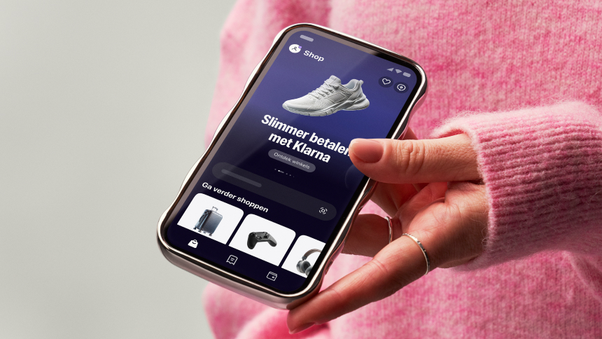
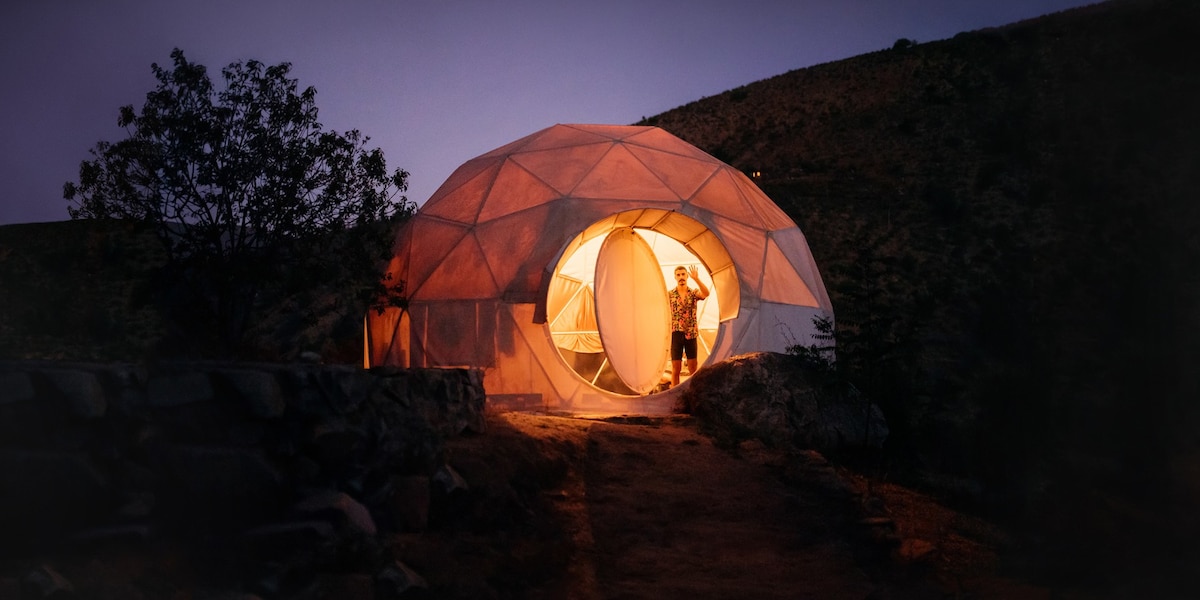
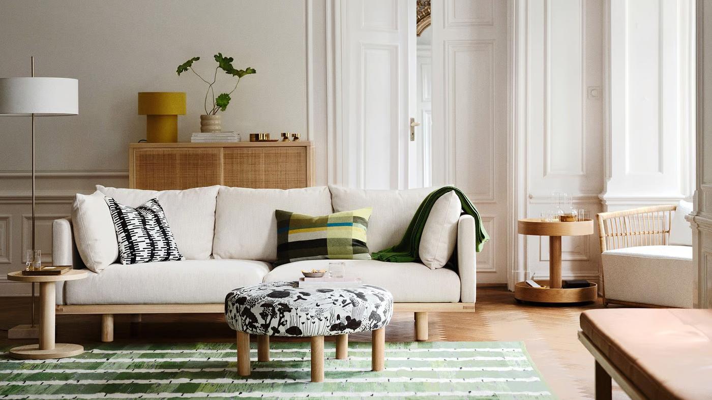
PayPal's German consumer site reads as confident, friendly fintech. The canvas is calm and high-contrast: white and a warm off-white carry most pages, black ink carries nearly all text, and brand color appears in deliberate full-bleed blocks. Those blocks are a deep navy business band and a bright sky field behind the hero, not sprinkled accents. Lifestyle photography in large rounded containers adds warmth. The copy is short and reassuring, aimed at everyday shoppers with a parallel business audience.
Hierarchy comes almost entirely from type scale. Display headlines are set in PayPal Pro at weight 900 with tight tracking, on a ladder that runs from title-lg (25.8751px) up to hero-display (180.911px). Below them, body and UI text drops sharply to PayPal Pro Text VF at 14–21px. Little sits in between, so the jump from headline to subcopy is the main signal of importance. Sections stack as centered, single-column hero blocks: an optional toggle or eyebrow, a giant headline, a line of subcopy, a pair of pill CTAs, then a wide image or card.
Density is low. Each block gets generous vertical air, and controls are uniform 48px pills. Elevation is used sparingly and softly. Most separation comes from color-block changes, and diffuse shadows are reserved for floating layers such as the cookie banner, phone-style cards and bottom sheets.
Key Characteristics:
- Ultra-heavy (900) PayPal Pro display type, tracked at roughly −3% of size, scaling from
title-lg to hero-display.
- Near-universal black ink Ink (
ink, #000000) on Canvas (canvas, #FFFFFF) and Parchment (surface-warm, #F1EFEA).
- Brand color as full-bleed blocks: PayPal Navy (
primary, #002991) with Sky Cyan (accent-on-dark, #60CDFF) as its accent.
- Pill everything: buttons are 1000px-radius, 48px-tall capsules, and toggles and tabs are 96px-radius segmented tracks.
- Soft geometry on containers:
rounded.lg (24px) cards and larger radii up to rounded.3xl on media.
- Translucent and tinted button fills (
button-primary #FFFFFFB3, button-secondary-2 #05378214) rather than loud brand-colored buttons.
- Light, multi-layer diffuse shadows only on floating layers; no blur effects.
- A visible focus treatment: a white 2px halo plus a 2px blue outline offset by 2px.
The palette is mostly monochrome, with two brand blues used as fields and a family of interactive blues kept for links and focus. No gradients were observed; every surface is a flat fill.
- PayPal Navy (
primary, #002991): the brand anchor. Use it as a full-bleed surface for business and feature bands, with white text (on-primary) on top. Never use it for small text or borders.
- Sky Cyan (
accent-on-dark, #60CDFF): the accent on navy fields, for highlighted words and secondary headings. It also appears as a bright color-block surface behind the hero, where black ink sits on it.
- Bright Blue (
primary-bright, #0070E0): an interactive blue seen on text. Reserve it for inline interactive emphasis, not for surfaces.
- Link Blue (
link, #0066F5): the link text color. It is also the focus outline on the link-style CTAs: button-primary-2 (flagged: render matched 83% of original pixels on hover) and button-secondary-2 (flagged: render matched 88% on hover).
- Browser Blue (
link-default, #0000EE): the user-agent default link color. It surfaced in text on four pages, which most likely means unstyled links. Do not design with it intentionally; use link instead.
- Canvas (
canvas, #FFFFFF): the default page and card background, and the header bar.
- Parchment (
surface-warm, #F1EFEA): a warm off-white for alternating sections and soft content panels. It sits on all five captured pages.
- On Primary (
on-primary, #FFFFFF): text and icons placed on navy or other dark fields.
- Ink (
ink, #000000): headlines, body and button labels. Pure black is the default; do not soften it to grey for body copy.
- Slate (
muted, #686A6D): secondary text and the button-ghost label (#686A6D). Use it for supporting UI, not paragraphs.
- Mist (
hairline, #CFD3D8): the 2px outline on button-primary and button-secondary, and the thin divider under the header.
These colors were measured on components, not in page sampling.
- Focus Blue (
focus-ring, #097FF5): the 2px focus outline on button-primary, button-secondary and button-ghost, paired with a #FFFFFF 2px halo.
- Graphite (
surface-dark, #333333): the hover fill of the black button-primary-2 (flagged: render matched 83% of original pixels on hover).
Translucent fills also live only in recipes:
| Fill | Used on |
|---|
| #FFFFFFB3 | button-primary and button-secondary |
| #F0F2F9 | hover on button-primary and button-secondary |
| #F5F7FB | button-ghost hover |
| #05378214 | tab track and button-secondary-2 |
| #05378227 | button-secondary-2 hover |
| #FFFFFF3D | toggle track |
| #000000A1 | inactive label in toggle (toggle-text-2) and tab (tab-text) |
- PayPal Pro is the proprietary display face, used only at weight 900 for every headline token from
title-lg to hero-display.
- PayPal Pro Text VF is the variable text face. It carries body, links, nav, the
button-ghost label, and the tab and toggle labels. It is by far the most-used family on all five pages.
- PayPalOpen-Medium is a secondary UI face measured on
button-primary and button-secondary labels: 14px, weight 500, 18px line height, −0.28px tracking. Its fallback stack is "Helvetica Neue", Arial, sans-serif.
The PayPal Pro Text VF fallback stack is Helvetica, Arial, sans-serif.
| Token | Size | Weight | Line Height | Letter Spacing | Use |
|---|
hero-display | 180.911px | 900 | 1 | -5.42734px | One-off giant hero words or statements |
display-2xl | 148.089px | 900 | 1 | -4.44266px | Section-opening statement headlines |
display-xl | 99.447px | 900 | 1.1 | -2.98341px | Large feature headlines |
display-lg | 81.5px | 900 | 1.1 | -2.445px | Page h1 / hero headline |
display-md | 67.1072px | 900 | 1.1 | -2.01322px | Major h2 section headlines |
headline-lg | 55.3392px | 900 | 1.1 | -1.66018px | Standard h2/h3 section heads |
headline-md | 45.4643px | 900 | 1.1 | -1.36393px | Sub-section and card-group heads |
title-lg | 25.8751px | 900 | 1.2 | -0.517501px | Card titles, small heads |
Body text has no published token, but it was measured in PayPal Pro Text VF:
| Role | Size | Weight | Line Height | Letter Spacing |
|---|
| Paragraph | 17.8572px | 400 | 1.5 | -0.267857px |
| Bold inline and links | 17.8572px | 700 | 1.5 | -0.267857px |
| Lead paragraph | 21.5178px | 400 | 1.5 | -0.322768px |
| CTA label | 16px | 700 | 1.5 | -0.24px |
| Small | 14px | 400 / 700 | 1.5 | -0.21px |
Control label (tab, toggle) | 12px | 700 | 16px | -0.18px |
- Weights are 400, 700 and 900. 900 is exclusive to PayPal Pro display. 700 marks emphasis, links and CTA labels in the text face. 400 is running text. The only weight-500 text is the PayPalOpen-Medium label on
button-primary and button-secondary; do not spread 500 elsewhere.
- Tracking is proportional and always negative. Display tokens track at about −3% of their size,
title-lg at −2%, and body at about −1.5%. Scale letter-spacing with size rather than using a fixed value.
- Line height tightens as size grows. The biggest two tokens run at 1, display and headlines at 1.1,
title-lg at 1.2, and body at 1.5. Headlines are meant to stack as tight blocks.
- There is no middle tier. The ladder jumps from 25.8751px headlines to roughly 18–21px body. Do not invent a semibold 20–24px subhead; use
title-lg or a 700-weight body line.
PayPal Pro and PayPal Pro Text are proprietary.
- Display: use a geometric sans with a true Black cut, such as Figtree 900 or Plus Jakarta Sans 800. Keep the −3% tracking and line height 1–1.1. Check that counters don't clog at 900; if they do, step back to 800 before loosening the tracking.
- Text: Inter or Figtree at 400/700 work well. Keep the −1.5% tracking and line height 1.5.
- PayPalOpen-Medium: Inter 500 at 14px is a close stand-in.
No base step and no page-level section rhythm were verified. The only measured spacing tokens come from the verified buttons.
| Token | Value | Measured on |
|---|
button-primary-padding-y | 10px | button-primary, vertical padding of the root |
button-primary-padding-x | 30px | button-primary, horizontal padding of the root |
button-secondary-padding-y | 10px | button-secondary, vertical padding of the root |
button-secondary-padding-x | 30px | button-secondary, horizontal padding of the root |
button-ghost-padding-y | 12px | button-ghost, vertical padding of the root |
button-ghost-padding-x | 12px | button-ghost, horizontal padding of the root |
Pill buttons are wide and short. Horizontal padding (button-primary-padding-x, 30px) is triple the vertical (button-primary-padding-y, 10px), which gives the capsule its stretched look. Ghost buttons are square-padded on all sides (button-ghost-padding-x / button-ghost-padding-y, 12px) around an icon and label.
No container max width or grid gap was verified as a token.
The screenshots show these patterns:
- Hero blocks: a centered, narrow single column for headline, subcopy and the CTA pair, followed by a wide media card.
- Header: logo and dropdown menus on the left; Hilfe, Einloggen and Neu anmelden on the right.
- Business page: a staggered photo strip that bleeds to the viewport edges, followed by a full-width navy band.
- Color blocks: these run edge to edge while text stays centered inside them.
Whitespace is the separator. Sections are divided by generous vertical air and by a change of surface color (canvas → surface-warm → primary), not by rules or boxes.
Within a block, elements sit close together: headline, subcopy and CTAs read as one unit. That unit is then surrounded by a lot of empty space. Keep text columns narrow, even on wide screens, so the oversized headlines wrap into dense, poster-like stacks.
Every spacing token restates a measurement of a verified component recipe, or the step those measurements share.
button-primary-padding-y: 10px (button-primary, vertical padding of the root)button-primary-padding-x: 30px (button-primary, horizontal padding of the root)button-secondary-padding-y: 10px (button-secondary, vertical padding of the root)button-secondary-padding-x: 30px (button-secondary, horizontal padding of the root)button-ghost-padding-y: 12px (button-ghost, vertical padding of the root)button-ghost-padding-x: 12px (button-ghost, horizontal padding of the root)
| Level | Treatment | Use |
|---|
| Flat | No shadow; separation by surface color (canvas, surface-warm, primary) | Page sections, hero fields, navy bands |
| Hairline | 2px solid #CFD3D8 border (hairline) | Outline on button-primary and button-secondary; thin header divider |
| Ambient lift | rgba(0, 0, 0, 0.01) 0px 0px 17px 0px, rgba(0, 0, 0, 0.01) 0px 0px 15px 0px, rgba(0, 0, 0, 0.02) 0px 0px 13px 0px, rgba(0, 0, 0, 0.03) 0px -10px 10px 0px, rgba(0, 0, 0, 0.04) 0px 0px 5px 0px | Barely-there halo on floating layers, e.g. the cookie banner and bottom sheet (biased upward by the −10px layer) |
| Floating card | rgba(0, 0, 0, 0.14) 4px 4px 28px 6px | White phone-style cards and overlays that sit over imagery |
| Deep drop | rgba(0, 0, 0, 0.08) 0px 24px 48px 0px | A single large, soft drop under a raised media or card element (one page) |
| Shape mask | rgb(255, 255, 255) 0px -28.5714px 0px 28.5714px and rgb(255, 255, 255) 0px 28.5714px 0px 28.5714px | Solid white spread shadows used as a masking trick to carve inverted corners, not to create depth |
| Focus | box-shadow #FFFFFF 0px 0px 0px 2px plus outline 2px solid #097FF5, offset 2px | Keyboard focus on button-primary, button-secondary and button-ghost |
| Focus (link CTAs) | outline 2px solid #0066F5, offset 2px | button-primary-2 (flagged: render matched 83% of original pixels on hover) and button-secondary-2 (flagged: render matched 88% on hover) |
No backdrop blur was measured anywhere.
Shadow philosophy. Depth exists but is whispered. Shadows have very low alpha (0.01–0.14), large blur radii and almost no offset, so floating layers feel lifted off the page rather than cast onto it. They belong only to things that genuinely float: banners, sheets and cards over imagery. Everything in normal flow relies on color-block contrast and the hairline outline. The one crisp ring in the system is the focus halo; never weaken it.
| Token | Value | Use |
|---|
rounded.xs | 8px | Small chips, thumbnails, minor UI |
rounded.sm | 12px | Compact panels (rare, one page) |
rounded.md | 16px | Banners such as the cookie notice, inner cards |
rounded.lg | 24px | Standard content cards and hero imagery; the workhorse container radius |
rounded.xl | 29.9952px | Large phone-style card corners (one-off) |
rounded.2xl | 68.5714px | Oversized media container (one-off) |
rounded.3xl | 96px | Segmented tracks: toggle and tab (96px) |
rounded.full | 9999px | Pills and circles, the most frequent radius on the site |
The geometry is soft and pill-dominant.
- Pills: every button is a full capsule.
button-primary, button-secondary, button-primary-2 (flagged: render matched 83% on hover) and button-secondary-2 (flagged: render matched 88% on hover) all measure 1000px. Treat that as equivalent to rounded.full.
- Segmented controls: the Privat/Geschäftlich
toggle and the tab control are 96px-radius pill tracks with 2px inner padding.
- Circles: icon-only controls such as close buttons are circular.
- Containers: these step up through
rounded.md and rounded.lg to dramatic radii on large media. The big radii echo the rounded geometric letterforms and the PayPal P mark.
- Square corners appear only on a few full-bleed photo tiles. Treat them as an exception for edge-to-edge imagery, not a container style.
Each component below was distilled from the live page: the recipe is a standalone, placeholder-filled reproduction with literal values, and every frontmatter key named in the anatomy carries the same measurements. A verified component reproduced the original in every check; a flagged one is shipped with the reason it did not; one marked not verifiable could not be compared with the original, which says nothing about the recipe.
Verification: verified against the live page at desktop.
Anatomy
button-primary: the component root, a <button> (.c-button-primary), 11-character label
Recipe
HTML · CSS
<div class="c-button-primary-scope">
  <button class="c-button-primary" type="button">lorem ipsum</button>
</div>
.c-button-primary-scope {
  background-color: #F0F2F9;
  color: #000000;
  font-family: "PayPal Pro Text VF", Helvetica, Arial, sans-serif;
  font-size: 16px;
  font-weight: 400;
  line-height: 18.4px;
}

.c-button-primary {
  display: inline-flex;
  justify-content: center;
  align-items: center;
  border-spacing: 0px;
  box-sizing: border-box;
  min-width: 96px;
  min-height: 48px;
  padding: 10px 30px;
  position: relative;
  background-color: #FFFFFFB3;
  color: #000000;
  border: 2px solid #CFD3D8;
  border-radius: 1000px;
  cursor: pointer;
  font-family: PayPalOpen-Medium, "Helvetica Neue", Arial, sans-serif;
  font-size: 14px;
  font-weight: 500;
  line-height: 18px;
  letter-spacing: -0.28px;
  text-transform: none;
  text-align: center;
  appearance: button;
  transition-duration: 0.2s, 0.2s, 0.2s;
  transition-timing-function: ease, ease, ease;
  transition-property: color, background-color, border-color;
}

.c-button-primary:hover {
  background-color: #F0F2F9;
}

.c-button-primary:focus {
  box-shadow: #FFFFFF 0px 0px 0px 2px;
  outline: 2px solid #097FF5;
  outline-offset: 2px;
}
States
- hover (
button-primary-hover): background-color #F0F2F9
- focus: box-shadow #FFFFFF 0px 0px 0px 2px, outline 2px solid #097FF5, outline-offset 2px
Verification: verified against the live page at desktop.
Anatomy
button-secondary: the component root, a <button> (.c-button-secondary), 8-character label
Recipe
HTML · CSS
<div class="c-button-secondary-scope">
  <button class="c-button-secondary" type="button">lorem ip</button>
</div>
.c-button-secondary-scope {
  background-color: #F0F2F9;
  color: #000000;
  font-family: "PayPal Pro Text VF", Helvetica, Arial, sans-serif;
  font-size: 16px;
  font-weight: 400;
  line-height: 18.4px;
}

.c-button-secondary {
  display: inline-flex;
  justify-content: center;
  align-items: center;
  border-spacing: 0px;
  box-sizing: border-box;
  min-width: 96px;
  min-height: 48px;
  padding: 10px 30px;
  position: relative;
  background-color: #FFFFFFB3;
  color: #000000;
  border: 2px solid #CFD3D8;
  border-radius: 1000px;
  cursor: pointer;
  font-family: PayPalOpen-Medium, "Helvetica Neue", Arial, sans-serif;
  font-size: 14px;
  font-weight: 500;
  line-height: 18px;
  letter-spacing: -0.28px;
  text-transform: none;
  text-align: center;
  appearance: button;
  transition-duration: 0.2s, 0.2s, 0.2s;
  transition-timing-function: ease, ease, ease;
  transition-property: color, background-color, border-color;
}

.c-button-secondary:hover {
  background-color: #F0F2F9;
}

.c-button-secondary:focus {
  box-shadow: #FFFFFF 0px 0px 0px 2px;
  outline: 2px solid #097FF5;
  outline-offset: 2px;
}
States
- hover (
button-secondary-hover): background-color #F0F2F9
- focus: box-shadow #FFFFFF 0px 0px 0px 2px, outline 2px solid #097FF5, outline-offset 2px
Verification: verified against the live page at desktop.
Anatomy
button-ghost: the component root, a <button> (.c-button-ghost)button-ghost-group: inner group (.c-button-ghost__group)button-ghost-icon: icon placeholder, 24px (.c-button-ghost__icon)button-ghost-label: label text, 5 characters (.c-button-ghost__label)
Recipe
HTML · CSS
<div class="c-button-ghost-scope">
  <button class="c-button-ghost" type="button">
    <span class="c-button-ghost__group">
      <span class="c-button-ghost__icon" aria-hidden="true"></span>
    </span>
    <span class="c-button-ghost__label">lorem</span>
  </button>
</div>
.c-button-ghost-scope {
  background-color: #F0F2F9;
  color: #000000;
  font-family: "PayPal Pro Text VF", Helvetica, Arial, sans-serif;
  font-size: 16px;
  font-weight: 400;
  line-height: 18.4px;
}

.c-button-ghost {
  display: inline-flex;
  justify-content: center;
  align-items: center;
  border-spacing: 0px;
  box-sizing: border-box;
  width: 48px;
  height: 48px;
  padding: 12px;
  position: relative;
  background-color: transparent;
  color: #686A6D;
  border: 0;
  border-radius: 50%;
  cursor: pointer;
  font-family: "PayPal Pro Text VF", Helvetica, Arial, sans-serif;
  font-size: 16px;
  font-weight: 400;
  line-height: 18.4px;
  letter-spacing: normal;
  text-transform: none;
  text-align: center;
  appearance: button;
}

.c-button-ghost__group {
  display: block;
  box-sizing: border-box;
  width: 24px;
  height: 24px;
  aspect-ratio: 1 / 1;
}

.c-button-ghost__icon {
  display: block;
  flex-shrink: 0;
  box-sizing: border-box;
  width: 24px;
  height: 24px;
  overflow-x: hidden;
  overflow-y: hidden;
  background-color: currentcolor;
}

.c-button-ghost__label {
  display: block;
  box-sizing: border-box;
  width: 1px;
  height: 1px;
  position: absolute;
  overflow-x: hidden;
  overflow-y: hidden;
}

.c-button-ghost:hover {
  background-color: #F5F7FB;
}

.c-button-ghost:focus {
  box-shadow: #FFFFFF 0px 0px 0px 2px;
  outline: 2px solid #097FF5;
  outline-offset: 2px;
}
States
- hover (
button-ghost-hover): background-color #F5F7FB
- focus: box-shadow #FFFFFF 0px 0px 0px 2px, outline 2px solid #097FF5, outline-offset 2px
Verification: verified against the live page at desktop.
Anatomy
toggle: the component root, a <nav> (.c-toggle)toggle-list: inner flex row (.c-toggle__list)toggle-link-active: link (.c-toggle__link-active)toggle-text: label text, 6 characters (.c-toggle__text)toggle-link: link (.c-toggle__link)toggle-text-2: label text, 12 characters (.c-toggle__text-2)
Recipe
HTML · CSS
<div class="c-toggle-scope">
  <nav class="c-toggle">
    <ul class="c-toggle__list">
      <a class="c-toggle__link-active" href="#">
        <span class="c-toggle__text">lorem</span>
      </a>
      <a class="c-toggle__link" href="#">
        <span class="c-toggle__text-2">lorem ipsum</span>
      </a>
    </ul>
  </nav>
</div>
.c-toggle-scope {
  background-color: #60CDFF;
  color: #000000;
  font-family: "PayPal Pro Text VF", Helvetica, Arial, sans-serif;
  font-size: 16px;
  font-weight: 400;
  line-height: 18.4px;
}

.c-toggle {
  display: flex;
  gap: 8px;
  border-spacing: 0px;
  box-sizing: border-box;
  width: fit-content;
  padding: 2px;
  background-color: #FFFFFF3D;
  color: #000000;
  border-radius: 96px;
  font-family: "PayPal Pro Text VF", Helvetica, Arial, sans-serif;
  font-size: 16px;
  font-weight: 400;
  line-height: 18.4px;
}

.c-toggle__list {
  display: flex;
  gap: 2px;
  box-sizing: border-box;
  width: fit-content;
  padding: 0px;
  margin: 0px;
  list-style-type: none;
}

.c-toggle__link-active {
  display: flex;
  align-self: center;
  box-sizing: border-box;
  padding: 10px 16px;
  position: relative;
  z-index: 0;
  color: #000000;
  cursor: pointer;
  line-height: 22.4px;
  text-decoration-line: none;
  text-align: center;
  white-space: nowrap;
}

.c-toggle__link-active::before {
  content: "";
  display: block;
  box-sizing: border-box;
  width: 66px;
  height: 36px;
  position: absolute;
  top: 0px;
  right: 0px;
  bottom: 0px;
  left: 0px;
  z-index: -1;
  background-color: #FFFFFF;
  border-radius: 88px;
  transition: all 0.3s cubic-bezier(0.22, 1, 0.36, 1);
}

.c-toggle__text {
  display: block;
  box-sizing: border-box;
  max-width: 623.7px;
  font-size: 12px;
  font-weight: 700;
  line-height: 16px;
  letter-spacing: -0.18px;
}

.c-toggle__link {
  display: flex;
  align-self: center;
  box-sizing: border-box;
  padding: 10px 16px;
  position: relative;
  z-index: 0;
  color: #000000;
  cursor: pointer;
  line-height: 22.4px;
  text-decoration-line: none;
  text-align: center;
  white-space: nowrap;
}

.c-toggle__link::before {
  content: "";
  display: block;
  box-sizing: border-box;
  width: 97px;
  height: 28px;
  position: absolute;
  top: 4px;
  right: 4px;
  bottom: 4px;
  left: 4px;
  z-index: -1;
  border-radius: 88px;
  transition: all 0.3s cubic-bezier(0.22, 1, 0.36, 1);
}

.c-toggle__text-2 {
  display: block;
  box-sizing: border-box;
  max-width: 623.7px;
  color: #000000A1;
  font-size: 12px;
  font-weight: 700;
  line-height: 16px;
  letter-spacing: -0.18px;
}
States
- No hover or focus change was observed.
Verification: flagged, the render matched 83% of the original pixels, below the 97% required on hover after 2 correction attempts.
Anatomy
button-primary-2: the component root, a <a> (.c-button-primary-2), 12-character label
Recipe
HTML · CSS
<div class="c-button-primary-2-scope">
  <a class="c-button-primary-2" href="#">lorem ipsum</a>
</div>
.c-button-primary-2-scope {
  background-color: #FFFFFF;
  color: #000000;
  font-family: "PayPal Pro Text VF", Helvetica, Arial, sans-serif;
  font-size: 16px;
  font-weight: 400;
  line-height: 18.4px;
}

.c-button-primary-2 {
  display: inline-block;
  justify-content: center;
  align-items: center;
  border-spacing: 0px;
  box-sizing: border-box;
  height: fit-content;
  padding: 12px 20px;
  position: relative;
  background-color: #000000;
  color: #FFFFFF;
  border-radius: 1000px;
  cursor: pointer;
  font-family: "PayPal Pro Text VF", Helvetica, Arial, sans-serif;
  font-size: 16px;
  font-weight: 700;
  line-height: 24px;
  letter-spacing: -0.24px;
  text-decoration-line: none;
  text-align: center;
  transition-duration: 0.3s;
  transition-timing-function: cubic-bezier(0.4, 1.2, 0.2, 1);
  transition-property: padding, margin, width, height;
}

.c-button-primary-2:hover {
  padding: 14px 22px;
  margin: -2px;
  background-color: #333333;
}

.c-button-primary-2:focus {
  outline: 2px solid #0066F5;
  outline-offset: 2px;
}
States
- hover (
button-primary-2-hover): padding 14px 22px, margin -2px, background-color #333333
- focus: outline 2px solid #0066F5, outline-offset 2px
Verification: flagged, the render matched 88% of the original pixels, below the 97% required on hover after 2 correction attempts.
Anatomy
button-secondary-2: the component root, a <a> (.c-button-secondary-2), 17-character label
Recipe
HTML · CSS
<div class="c-button-secondary-2-scope">
  <a class="c-button-secondary-2" href="#">lorem ipsum dolor</a>
</div>
.c-button-secondary-2-scope {
  background-color: #FFFFFF;
  color: #000000;
  font-family: "PayPal Pro Text VF", Helvetica, Arial, sans-serif;
  font-size: 16px;
  font-weight: 400;
  line-height: 18.4px;
}

.c-button-secondary-2 {
  display: inline-block;
  justify-content: center;
  align-items: center;
  border-spacing: 0px;
  box-sizing: border-box;
  height: fit-content;
  padding: 12px 20px;
  position: relative;
  background-color: #05378214;
  color: #000000;
  border-radius: 1000px;
  box-shadow: transparent 0px 0px 0px 1px inset;
  cursor: pointer;
  font-family: "PayPal Pro Text VF", Helvetica, Arial, sans-serif;
  font-size: 16px;
  font-weight: 700;
  line-height: 24px;
  letter-spacing: -0.24px;
  text-decoration-line: none;
  text-align: center;
  transition-duration: 0.3s;
  transition-timing-function: cubic-bezier(0.4, 1.2, 0.2, 1);
  transition-property: padding, margin, width, height;
}

.c-button-secondary-2:hover {
  padding: 14px 22px;
  margin: -2px;
  background-color: #05378227;
  box-shadow: none;
}

.c-button-secondary-2:focus {
  outline: 2px solid #0066F5;
  outline-offset: 2px;
}
States
- hover (
button-secondary-2-hover): padding 14px 22px, margin -2px, background-color #05378227, box-shadow none
- focus: outline 2px solid #0066F5, outline-offset 2px
Verification: verified against the live page at desktop.
Anatomy
tab: the component root, a <nav> (.c-tab)tab-list: inner flex row (.c-tab__list)tab-link: link (.c-tab__link)tab-text: label text, 6 characters (.c-tab__text)tab-link-active: link (.c-tab__link-active)tab-text-2: label text, 12 characters (.c-tab__text-2)
Recipe
HTML · CSS
<div class="c-tab-scope">
  <nav class="c-tab">
    <ul class="c-tab__list">
      <a class="c-tab__link" href="#">
        <span class="c-tab__text">lorem</span>
      </a>
      <a class="c-tab__link-active" href="#">
        <span class="c-tab__text-2">lorem ipsum</span>
      </a>
    </ul>
  </nav>
</div>
.c-tab-scope {
  background-color: #FFFFFF;
  color: #000000;
  font-family: "PayPal Pro Text VF", Helvetica, Arial, sans-serif;
  font-size: 16px;
  font-weight: 400;
  line-height: 18.4px;
}

.c-tab {
  display: inline-flex;
  gap: 8px;
  border-spacing: 0px;
  box-sizing: border-box;
  width: fit-content;
  padding: 2px;
  background-color: #05378214;
  color: #000000;
  border-radius: 96px;
  font-family: "PayPal Pro Text VF", Helvetica, Arial, sans-serif;
  font-size: 16px;
  font-weight: 400;
  line-height: 18.4px;
}

.c-tab__list {
  display: flex;
  gap: 2px;
  box-sizing: border-box;
  width: fit-content;
  padding: 0px;
  margin: 0px;
  list-style-type: none;
}

.c-tab__link {
  display: flex;
  align-self: center;
  box-sizing: border-box;
  padding: 10px 16px;
  position: relative;
  z-index: 0;
  color: #000000;
  cursor: pointer;
  line-height: 22.4px;
  text-decoration-line: none;
  text-align: center;
  white-space: nowrap;
}

.c-tab__link::before {
  content: "";
  display: block;
  box-sizing: border-box;
  width: 58px;
  height: 28px;
  position: absolute;
  top: 4px;
  right: 4px;
  bottom: 4px;
  left: 4px;
  z-index: -1;
  border-radius: 88px;
  transition: all 0.3s cubic-bezier(0.22, 1, 0.36, 1);
}

.c-tab__text {
  display: block;
  box-sizing: border-box;
  max-width: 623.7px;
  color: #000000A1;
  font-size: 12px;
  font-weight: 700;
  line-height: 16px;
  letter-spacing: -0.18px;
}

.c-tab__link-active {
  display: flex;
  align-self: center;
  box-sizing: border-box;
  padding: 10px 16px;
  position: relative;
  z-index: 0;
  color: #000000;
  cursor: pointer;
  line-height: 22.4px;
  text-decoration-line: none;
  text-align: center;
  white-space: nowrap;
}

.c-tab__link-active::before {
  content: "";
  display: block;
  box-sizing: border-box;
  width: 105px;
  height: 36px;
  position: absolute;
  top: 0px;
  right: 0px;
  bottom: 0px;
  left: 0px;
  z-index: -1;
  background-color: #FFFFFF;
  border-radius: 88px;
  transition: all 0.3s cubic-bezier(0.22, 1, 0.36, 1);
}

.c-tab__text-2 {
  display: block;
  box-sizing: border-box;
  max-width: 623.7px;
  font-size: 12px;
  font-weight: 700;
  line-height: 16px;
  letter-spacing: -0.18px;
}
States
- No hover or focus change was observed.
Verification: flagged, the render matched 88% of the original pixels, below the 96% required after 2 correction attempts.
Anatomy
video-control: the component root, a <button> (.c-video-control)video-control-group: inner flex row (.c-video-control__group)video-control-group-2: inner group (.c-video-control__group-2)video-control-icon: icon placeholder, 24px (.c-video-control__icon)
Recipe
HTML · CSS
<div class="c-video-control-scope">
  <button class="c-video-control" type="button">
    <span class="c-video-control__group">
      <span class="c-video-control__group-2">
        <span class="c-video-control__icon" aria-hidden="true"></span>
      </span>
    </span>
  </button>
</div>
.c-video-control-scope {
  background-color: #FFFFFF;
  color: #000000;
  font-family: "PayPal Pro Text VF", Helvetica, Arial, sans-serif;
  font-size: 16px;
  font-weight: 400;
  line-height: 8px;
}

.c-video-control {
  display: block;
  border-spacing: 0px;
  box-sizing: border-box;
  width: 40px;
  height: 40px;
  padding: 0px;
  position: absolute;
  right: 100%;
  bottom: 100%;
  background-color: transparent;
  color: #000000;
  border: 0;
  cursor: pointer;
  font-family: "PayPal Pro Text VF", Helvetica, Arial, sans-serif;
  font-size: 16px;
  font-weight: 400;
  line-height: 18.4px;
  letter-spacing: normal;
  text-transform: none;
  text-align: center;
  appearance: button;
  transition: opacity 0.6s cubic-bezier(0.22, 1, 0.36, 1);
}

.c-video-control__group {
  display: flex;
  justify-content: center;
  align-items: center;
  box-sizing: border-box;
  width: 40px;
  height: 40px;
  border: 2px solid #FFFFFF;
  border-radius: 50%;
}

.c-video-control__group-2 {
  display: block;
  box-sizing: border-box;
  width: 24px;
  height: 24px;
  aspect-ratio: 1 / 1;
}

.c-video-control__icon {
  display: block;
  flex-shrink: 0;
  box-sizing: border-box;
  width: 24px;
  height: 24px;
  overflow-x: hidden;
  overflow-y: hidden;
  background-color: currentcolor;
}

.c-video-control:focus {
  outline: none;
}
States
- Do set every headline in PayPal Pro at weight 900 using the ladder tokens (
hero-display through title-lg), with their negative tracking intact.
- Do limit weights to 400, 700 and 900. PayPalOpen-Medium 500 stays confined to the
button-primary / button-secondary labels.
- Do build buttons as pills at the 48px control height shared by
button-primary, button-secondary and button-ghost. Use 1000px radius (equivalent to rounded.full) with button-primary-padding-x 30px and button-primary-padding-y 10px.
- Do reuse the translucent white fill:
button-primary and button-secondary share #FFFFFFB3 with a hairline 2px outline and #F0F2F9 on hover. The fill is a shared outline-pill style, not a primary-only signal.
- Do use the black pill (
button-primary-2, #000000 fill, white label, #333333 hover) for the strongest CTA, knowing its hover state is flagged: render matched 83% of original pixels.
- Do separate sections with full-bleed surface changes between
canvas, surface-warm and primary, putting on-primary text and accent-on-dark highlights on navy.
- Do reserve shadows for floating layers, using the observed tiers
rgba(0, 0, 0, 0.14) 4px 4px 28px 6px or the five-layer ambient stack.
- Do keep the focus treatment visible: #FFFFFF 2px halo plus 2px
focus-ring outline, offset 2px.
- Don't use
primary (#002991) as a button fill or small text color. It is a field color.
- Don't introduce weight 500 or 600 in PayPal Pro Text VF, or any weight below 900 in PayPal Pro display.
- Don't set display type with normal or positive letter-spacing. Tracking scales at about −3% of size.
- Don't style links with
link-default (#0000EE). Use link (#0066F5).
- Don't add heavy, dark or offset shadows beyond the measured tiers, and don't add backdrop blur; none was measured.
- Don't use square corners on cards. Use
rounded.lg (24px) as the default container radius and keep squares only for full-bleed photo tiles.
- Don't grey out body copy with
muted. Paragraphs stay in ink; muted is for ghost actions and supporting UI.
- Don't add mid-sized semibold subheads between
title-lg and body. The hierarchy depends on the jump.
This analysis is two-viewport only: one desktop and one mobile capture. No breakpoint values were observed, so none are given.
- Navigation: the horizontal desktop header (logo and dropdowns left; Hilfe, Einloggen and Neu anmelden right) collapses to a hamburger menu next to two pill buttons.
- Headlines: display headlines keep their heavy, tight styling but wrap to about three lines. The type scale steps down rather than the layout changing.
- Cards and media: these go full-width with small side margins, keeping their rounded corners.
- Sticky bar: a black, sticky "App downloaden" bar appears at the bottom of the mobile viewport.
- Cookie banner: on desktop it is fixed over the lower viewport.
- Hero stacks: these are already single-column on desktop, so on mobile they simply narrow. The headline → subcopy → CTA pair → media order is preserved.
- All verified buttons (
button-primary, button-secondary, button-ghost) are 48px tall, which meets comfortable touch sizing.
- The segmented
toggle and tab controls are 40px tall. Keep them at least that size on mobile and don't compress the 2px inner track padding further.
- Reference tokens, never raw hex. Use
ink, canvas, surface-warm, primary, accent-on-dark, link, hairline and focus-ring. Translucent button fills such as #FFFFFFB3 and #05378214 belong to their component recipes (button-primary, tab, button-secondary-2); don't promote them into the page palette.
- Headlines must come from the eight typography tokens. If a new size seems needed, pick the nearest token rather than interpolating. All display text is PayPal Pro 900 with proportional negative tracking.
- Buttons are 48px pills. Edit variants inside the existing keys (
button-primary, button-secondary, button-ghost, button-primary-2, button-secondary-2) rather than creating new shapes. Padding comes from the button-*-padding-x and button-*-padding-y tokens.
- Treat flagged recipes as approximations.
button-primary-2 (flagged: render matched 83% on hover), button-secondary-2 (flagged: render matched 88% on hover) and video-control (flagged: render matched 88%) need visual checking before reuse.
- Elevation is a closed set. Use only the measured shadow tiers listed in the elevation section, on floating layers only. Never add backdrop blur or new shadow recipes.
- Brand blue is a field, not a decoration.
primary appears as full-bleed bands with on-primary text; accent-on-dark lives on those bands or as the bright hero field. Never put primary on buttons or body text.
- Never remove or restyle the focus treatment. It is a #FFFFFF 2px halo plus a 2px
focus-ring (or link on link-CTAs) outline, offset 2px.
- Body text tokens were dropped.
body, body-lg, body-strong, title-sm, button, button-lg, nav-link, caption and caption-strong were named for "PayPal Pro Text", but the site serves "PayPal Pro Text VF". Body sizes appear only as measured evidence in the typography section, not as published tokens.
- No layout measurements beyond button padding. No container max width, grid gap, base spacing unit or section padding was verified. Section rhythm sampling returned nothing.
- No header or footer landmarks were captured. Header height, sticky behavior, link counts and footer column structure are undocumented.
- Several hover states did not reproduce.
button-primary-2, button-secondary-2 and video-control are flagged at 83–88% pixel match, so their exact hover visuals are unconfirmed.
- The ghost button radius is unmeasured.
button-ghost carries no rounded value in its recipe; its circular or pill shape is inferred from screenshots.
- Pages not reached. Only five public marketing pages were captured. Logged-in wallet, checkout flows, forms, inputs, error states and the mobile hamburger menu's open state were not reached.
- Motion is undocumented. Video autoplay behavior and animations (including the
video-control play/pause) could not be captured.
- Interactive blues are only partly mapped.
primary-bright and link both appear as text; which elements use which beyond links was not resolved.
- Desktop-only recipes, two viewports. All recipes were measured on desktop, and responsive behavior is inferred from two viewports with no breakpoint values.
- Shadow use is partly inferred. The white spread shadows (
rgb(255, 255, 255) 0px ±28.5714px 0px 28.5714px) are interpreted as corner masks, and which floating layer uses which tier is inferred from screenshots.