100% 一致
ghost · desktop
通常時100%一致57件の計測値が一致
ホバー100%一致18件の計測値が一致
フォーカス100%一致18件の計測値が一致
抽出の信頼度
PayPalのオランダ語版ホームページは、鮮やかなスカイブルー(#60cdff)のヒーローセクションを核にした、大胆で消費者向けのデザインです。見出しには超極太のPayPal Pro w900を使い、黒の大きな文字で力強さを出しています。ナビゲーションは白地に黒文字で、アウトラインの「Inloggen」と塗りつぶしの黒い「Rekening openen」という2種類のCTAボタンを備えています。上部には濃紺のお知らせバナーが配置されています。全体として高コントラストで、ピル型の丸みを帯びた角とブランドタイポグラフィを軸にしており、幅広い消費者向け金融サービスの対象者に向けて、信頼感と分かりやすさを伝えています。
ghost · desktop
通常時100%一致57件の計測値が一致
ホバー100%一致18件の計測値が一致
フォーカス100%一致18件の計測値が一致
primary · desktop
通常時100%一致25件の計測値が一致
ホバー100%一致22件の計測値が一致
フォーカス100%一致22件の計測値が一致
primary · desktop
ホバー時、サイトとの一致度は83%で、基準の97%を下回っています。
通常時100%一致21件の計測値が一致
ホバー83%一致18件の計測値が一致
フォーカス100%一致18件の計測値が一致
secondary · desktop
通常時100%一致25件の計測値が一致
ホバー100%一致22件の計測値が一致
フォーカス100%一致22件の計測値が一致
secondary · desktop
ホバー時、サイトとの一致度は88%で、基準の97%を下回っています。
通常時100%一致21件の計測値が一致
ホバー88%一致18件の計測値が一致
フォーカス100%一致18件の計測値が一致
desktop
通常時100%一致85件の計測値が一致
desktop
通常時100%一致85件の計測値が一致
desktop
サイトとの一致度は88%で、基準の96%を下回っています。
通常時88%一致82件の計測値が一致
フォーカス58%一致18件の計測値が一致
PayPal
PayPal's German consumer site reads as confident, friendly fintech. The canvas is calm and high-contrast: white and a warm off-white carry most pages, black ink carries nearly all text, and brand color appears in deliberate full-bleed blocks. Those blocks are a deep navy business band and a bright sky field behind the hero, not sprinkled accents. Lifestyle photography in large rounded containers adds warmth. The copy is short and reassuring, aimed at everyday shoppers with a parallel business audience.
Hierarchy comes almost entirely from type scale. Display headlines are set in PayPal Pro at weight 900 with tight tracking, on a ladder that runs from title-lg (25.8751px) up to hero-display (180.911px). Below them, body and UI text drops sharply to PayPal Pro Text VF at 14–21px. Little sits in between, so the jump from headline to subcopy is the main signal of importance. Sections stack as centered, single-column hero blocks: an optional toggle or eyebrow, a giant headline, a line of subcopy, a pair of pill CTAs, then a wide image or card.
Density is low. Each block gets generous vertical air, and controls are uniform 48px pills. Elevation is used sparingly and softly. Most separation comes from color-block changes, and diffuse shadows are reserved for floating layers such as the cookie banner, phone-style cards and bottom sheets.
Key Characteristics:
title-lg to hero-display.ink, #000000) on Canvas (canvas, #FFFFFF) and Parchment (surface-warm, #F1EFEA).primary, #002991) with Sky Cyan (accent-on-dark, #60CDFF) as its accent.rounded.lg (24px) cards and larger radii up to rounded.3xl on media.button-primary #FFFFFFB3, button-secondary-2 #05378214) rather than loud brand-colored buttons.The palette is mostly monochrome, with two brand blues used as fields and a family of interactive blues kept for links and focus. No gradients were observed; every surface is a flat fill.
primary, #002991): the brand anchor. Use it as a full-bleed surface for business and feature bands, with white text (on-primary) on top. Never use it for small text or borders.accent-on-dark, #60CDFF): the accent on navy fields, for highlighted words and secondary headings. It also appears as a bright color-block surface behind the hero, where black ink sits on it.primary-bright, #0070E0): an interactive blue seen on text. Reserve it for inline interactive emphasis, not for surfaces.link, #0066F5): the link text color. It is also the focus outline on the link-style CTAs: button-primary-2 (flagged: render matched 83% of original pixels on hover) and button-secondary-2 (flagged: render matched 88% on hover).link-default, #0000EE): the user-agent default link color. It surfaced in text on four pages, which most likely means unstyled links. Do not design with it intentionally; use link instead.canvas, #FFFFFF): the default page and card background, and the header bar.surface-warm, #F1EFEA): a warm off-white for alternating sections and soft content panels. It sits on all five captured pages.on-primary, #FFFFFF): text and icons placed on navy or other dark fields.ink, #000000): headlines, body and button labels. Pure black is the default; do not soften it to grey for body copy.muted, #686A6D): secondary text and the button-ghost label (#686A6D). Use it for supporting UI, not paragraphs.hairline, #CFD3D8): the 2px outline on button-primary and button-secondary, and the thin divider under the header.These colors were measured on components, not in page sampling.
focus-ring, #097FF5): the 2px focus outline on button-primary, button-secondary and button-ghost, paired with a #FFFFFF 2px halo.surface-dark, #333333): the hover fill of the black button-primary-2 (flagged: render matched 83% of original pixels on hover).Translucent fills also live only in recipes:
| Fill | Used on |
|---|---|
| #FFFFFFB3 | button-primary and button-secondary |
| #F0F2F9 | hover on button-primary and button-secondary |
| #F5F7FB | button-ghost hover |
| #05378214 | tab track and button-secondary-2 |
| #05378227 | button-secondary-2 hover |
| #FFFFFF3D | toggle track |
| #000000A1 | inactive label in toggle (toggle-text-2) and tab (tab-text) |
title-lg to hero-display.button-ghost label, and the tab and toggle labels. It is by far the most-used family on all five pages.button-primary and button-secondary labels: 14px, weight 500, 18px line height, −0.28px tracking. Its fallback stack is "Helvetica Neue", Arial, sans-serif.The PayPal Pro Text VF fallback stack is Helvetica, Arial, sans-serif.
| Token | Size | Weight | Line Height | Letter Spacing | Use |
|---|---|---|---|---|---|
hero-display | 180.911px | 900 | 1 | -5.42734px | One-off giant hero words or statements |
display-2xl | 148.089px | 900 | 1 | -4.44266px | Section-opening statement headlines |
display-xl | 99.447px | 900 | 1.1 | -2.98341px | Large feature headlines |
display-lg | 81.5px | 900 | 1.1 | -2.445px | Page h1 / hero headline |
display-md | 67.1072px | 900 | 1.1 | -2.01322px | Major h2 section headlines |
headline-lg | 55.3392px | 900 | 1.1 | -1.66018px | Standard h2/h3 section heads |
headline-md | 45.4643px | 900 | 1.1 | -1.36393px | Sub-section and card-group heads |
title-lg | 25.8751px | 900 | 1.2 | -0.517501px | Card titles, small heads |
Body text has no published token, but it was measured in PayPal Pro Text VF:
| Role | Size | Weight | Line Height | Letter Spacing |
|---|---|---|---|---|
| Paragraph | 17.8572px | 400 | 1.5 | -0.267857px |
| Bold inline and links | 17.8572px | 700 | 1.5 | -0.267857px |
| Lead paragraph | 21.5178px | 400 | 1.5 | -0.322768px |
| CTA label | 16px | 700 | 1.5 | -0.24px |
| Small | 14px | 400 / 700 | 1.5 | -0.21px |
Control label (tab, toggle) | 12px | 700 | 16px | -0.18px |
button-primary and button-secondary; do not spread 500 elsewhere.title-lg at −2%, and body at about −1.5%. Scale letter-spacing with size rather than using a fixed value.title-lg at 1.2, and body at 1.5. Headlines are meant to stack as tight blocks.title-lg or a 700-weight body line.PayPal Pro and PayPal Pro Text are proprietary.
No base step and no page-level section rhythm were verified. The only measured spacing tokens come from the verified buttons.
| Token | Value | Measured on |
|---|---|---|
button-primary-padding-y | 10px | button-primary, vertical padding of the root |
button-primary-padding-x | 30px | button-primary, horizontal padding of the root |
button-secondary-padding-y | 10px | button-secondary, vertical padding of the root |
button-secondary-padding-x | 30px | button-secondary, horizontal padding of the root |
button-ghost-padding-y | 12px | button-ghost, vertical padding of the root |
button-ghost-padding-x | 12px | button-ghost, horizontal padding of the root |
Pill buttons are wide and short. Horizontal padding (button-primary-padding-x, 30px) is triple the vertical (button-primary-padding-y, 10px), which gives the capsule its stretched look. Ghost buttons are square-padded on all sides (button-ghost-padding-x / button-ghost-padding-y, 12px) around an icon and label.
No container max width or grid gap was verified as a token.
The screenshots show these patterns:
Whitespace is the separator. Sections are divided by generous vertical air and by a change of surface color (canvas → surface-warm → primary), not by rules or boxes.
Within a block, elements sit close together: headline, subcopy and CTAs read as one unit. That unit is then surrounded by a lot of empty space. Keep text columns narrow, even on wide screens, so the oversized headlines wrap into dense, poster-like stacks.
Every spacing token restates a measurement of a verified component recipe, or the step those measurements share.
button-primary-padding-y: 10px (button-primary, vertical padding of the root)button-primary-padding-x: 30px (button-primary, horizontal padding of the root)button-secondary-padding-y: 10px (button-secondary, vertical padding of the root)button-secondary-padding-x: 30px (button-secondary, horizontal padding of the root)button-ghost-padding-y: 12px (button-ghost, vertical padding of the root)button-ghost-padding-x: 12px (button-ghost, horizontal padding of the root)| Level | Treatment | Use |
|---|---|---|
| Flat | No shadow; separation by surface color (canvas, surface-warm, primary) | Page sections, hero fields, navy bands |
| Hairline | 2px solid #CFD3D8 border (hairline) | Outline on button-primary and button-secondary; thin header divider |
| Ambient lift | rgba(0, 0, 0, 0.01) 0px 0px 17px 0px, rgba(0, 0, 0, 0.01) 0px 0px 15px 0px, rgba(0, 0, 0, 0.02) 0px 0px 13px 0px, rgba(0, 0, 0, 0.03) 0px -10px 10px 0px, rgba(0, 0, 0, 0.04) 0px 0px 5px 0px | Barely-there halo on floating layers, e.g. the cookie banner and bottom sheet (biased upward by the −10px layer) |
| Floating card | rgba(0, 0, 0, 0.14) 4px 4px 28px 6px | White phone-style cards and overlays that sit over imagery |
| Deep drop | rgba(0, 0, 0, 0.08) 0px 24px 48px 0px | A single large, soft drop under a raised media or card element (one page) |
| Shape mask | rgb(255, 255, 255) 0px -28.5714px 0px 28.5714px and rgb(255, 255, 255) 0px 28.5714px 0px 28.5714px | Solid white spread shadows used as a masking trick to carve inverted corners, not to create depth |
| Focus | box-shadow #FFFFFF 0px 0px 0px 2px plus outline 2px solid #097FF5, offset 2px | Keyboard focus on button-primary, button-secondary and button-ghost |
| Focus (link CTAs) | outline 2px solid #0066F5, offset 2px | button-primary-2 (flagged: render matched 83% of original pixels on hover) and button-secondary-2 (flagged: render matched 88% on hover) |
No backdrop blur was measured anywhere.
Shadow philosophy. Depth exists but is whispered. Shadows have very low alpha (0.01–0.14), large blur radii and almost no offset, so floating layers feel lifted off the page rather than cast onto it. They belong only to things that genuinely float: banners, sheets and cards over imagery. Everything in normal flow relies on color-block contrast and the hairline outline. The one crisp ring in the system is the focus halo; never weaken it.
| Token | Value | Use |
|---|---|---|
rounded.xs | 8px | Small chips, thumbnails, minor UI |
rounded.sm | 12px | Compact panels (rare, one page) |
rounded.md | 16px | Banners such as the cookie notice, inner cards |
rounded.lg | 24px | Standard content cards and hero imagery; the workhorse container radius |
rounded.xl | 29.9952px | Large phone-style card corners (one-off) |
rounded.2xl | 68.5714px | Oversized media container (one-off) |
rounded.3xl | 96px | Segmented tracks: toggle and tab (96px) |
rounded.full | 9999px | Pills and circles, the most frequent radius on the site |
The geometry is soft and pill-dominant.
button-primary, button-secondary, button-primary-2 (flagged: render matched 83% on hover) and button-secondary-2 (flagged: render matched 88% on hover) all measure 1000px. Treat that as equivalent to rounded.full.toggle and the tab control are 96px-radius pill tracks with 2px inner padding.rounded.md and rounded.lg to dramatic radii on large media. The big radii echo the rounded geometric letterforms and the PayPal P mark.Each component below was distilled from the live page: the recipe is a standalone, placeholder-filled reproduction with literal values, and every frontmatter key named in the anatomy carries the same measurements. A verified component reproduced the original in every check; a flagged one is shipped with the reason it did not; one marked not verifiable could not be compared with the original, which says nothing about the recipe.
Button, primary
Verification: verified against the live page at desktop.
Anatomy
button-primary: the component root, a <button> (.c-button-primary), 11-character labelRecipe
<div class="c-button-primary-scope">
  <button class="c-button-primary" type="button">lorem ipsum</button>
</div>
.c-button-primary-scope {
  background-color: #F0F2F9;
  color: #000000;
  font-family: "PayPal Pro Text VF", Helvetica, Arial, sans-serif;
  font-size: 16px;
  font-weight: 400;
  line-height: 18.4px;
}

.c-button-primary {
  display: inline-flex;
  justify-content: center;
  align-items: center;
  border-spacing: 0px;
  box-sizing: border-box;
  min-width: 96px;
  min-height: 48px;
  padding: 10px 30px;
  position: relative;
  background-color: #FFFFFFB3;
  color: #000000;
  border: 2px solid #CFD3D8;
  border-radius: 1000px;
  cursor: pointer;
  font-family: PayPalOpen-Medium, "Helvetica Neue", Arial, sans-serif;
  font-size: 14px;
  font-weight: 500;
  line-height: 18px;
  letter-spacing: -0.28px;
  text-transform: none;
  text-align: center;
  appearance: button;
  transition-duration: 0.2s, 0.2s, 0.2s;
  transition-timing-function: ease, ease, ease;
  transition-property: color, background-color, border-color;
}

.c-button-primary:hover {
  background-color: #F0F2F9;
}

.c-button-primary:focus {
  box-shadow: #FFFFFF 0px 0px 0px 2px;
  outline: 2px solid #097FF5;
  outline-offset: 2px;
}
States
button-primary-hover): background-color #F0F2F9Button, secondary
Verification: verified against the live page at desktop.
Anatomy
button-secondary: the component root, a <button> (.c-button-secondary), 8-character labelRecipe
<div class="c-button-secondary-scope">
  <button class="c-button-secondary" type="button">lorem ip</button>
</div>
.c-button-secondary-scope {
  background-color: #F0F2F9;
  color: #000000;
  font-family: "PayPal Pro Text VF", Helvetica, Arial, sans-serif;
  font-size: 16px;
  font-weight: 400;
  line-height: 18.4px;
}

.c-button-secondary {
  display: inline-flex;
  justify-content: center;
  align-items: center;
  border-spacing: 0px;
  box-sizing: border-box;
  min-width: 96px;
  min-height: 48px;
  padding: 10px 30px;
  position: relative;
  background-color: #FFFFFFB3;
  color: #000000;
  border: 2px solid #CFD3D8;
  border-radius: 1000px;
  cursor: pointer;
  font-family: PayPalOpen-Medium, "Helvetica Neue", Arial, sans-serif;
  font-size: 14px;
  font-weight: 500;
  line-height: 18px;
  letter-spacing: -0.28px;
  text-transform: none;
  text-align: center;
  appearance: button;
  transition-duration: 0.2s, 0.2s, 0.2s;
  transition-timing-function: ease, ease, ease;
  transition-property: color, background-color, border-color;
}

.c-button-secondary:hover {
  background-color: #F0F2F9;
}

.c-button-secondary:focus {
  box-shadow: #FFFFFF 0px 0px 0px 2px;
  outline: 2px solid #097FF5;
  outline-offset: 2px;
}
States
button-secondary-hover): background-color #F0F2F9Button, ghost
Verification: verified against the live page at desktop.
Anatomy
button-ghost: the component root, a <button> (.c-button-ghost)button-ghost-group: inner group (.c-button-ghost__group)button-ghost-icon: icon placeholder, 24px (.c-button-ghost__icon)button-ghost-label: label text, 5 characters (.c-button-ghost__label)Recipe
<div class="c-button-ghost-scope">
  <button class="c-button-ghost" type="button">
    <span class="c-button-ghost__group">
      <span class="c-button-ghost__icon" aria-hidden="true"></span>
    </span>
    <span class="c-button-ghost__label">lorem</span>
  </button>
</div>
.c-button-ghost-scope {
  background-color: #F0F2F9;
  color: #000000;
  font-family: "PayPal Pro Text VF", Helvetica, Arial, sans-serif;
  font-size: 16px;
  font-weight: 400;
  line-height: 18.4px;
}

.c-button-ghost {
  display: inline-flex;
  justify-content: center;
  align-items: center;
  border-spacing: 0px;
  box-sizing: border-box;
  width: 48px;
  height: 48px;
  padding: 12px;
  position: relative;
  background-color: transparent;
  color: #686A6D;
  border: 0;
  border-radius: 50%;
  cursor: pointer;
  font-family: "PayPal Pro Text VF", Helvetica, Arial, sans-serif;
  font-size: 16px;
  font-weight: 400;
  line-height: 18.4px;
  letter-spacing: normal;
  text-transform: none;
  text-align: center;
  appearance: button;
}

.c-button-ghost__group {
  display: block;
  box-sizing: border-box;
  width: 24px;
  height: 24px;
  aspect-ratio: 1 / 1;
}

.c-button-ghost__icon {
  display: block;
  flex-shrink: 0;
  box-sizing: border-box;
  width: 24px;
  height: 24px;
  overflow-x: hidden;
  overflow-y: hidden;
  background-color: currentcolor;
}

.c-button-ghost__label {
  display: block;
  box-sizing: border-box;
  width: 1px;
  height: 1px;
  position: absolute;
  overflow-x: hidden;
  overflow-y: hidden;
}

.c-button-ghost:hover {
  background-color: #F5F7FB;
}

.c-button-ghost:focus {
  box-shadow: #FFFFFF 0px 0px 0px 2px;
  outline: 2px solid #097FF5;
  outline-offset: 2px;
}
States
button-ghost-hover): background-color #F5F7FBButton, primary (2)
Verification: flagged, the render matched 83% of the original pixels, below the 97% required on hover after 2 correction attempts.
Anatomy
button-primary-2: the component root, a <a> (.c-button-primary-2), 12-character labelRecipe
<div class="c-button-primary-2-scope">
  <a class="c-button-primary-2" href="#">lorem ipsum</a>
</div>
.c-button-primary-2-scope {
  background-color: #FFFFFF;
  color: #000000;
  font-family: "PayPal Pro Text VF", Helvetica, Arial, sans-serif;
  font-size: 16px;
  font-weight: 400;
  line-height: 18.4px;
}

.c-button-primary-2 {
  display: inline-block;
  justify-content: center;
  align-items: center;
  border-spacing: 0px;
  box-sizing: border-box;
  height: fit-content;
  padding: 12px 20px;
  position: relative;
  background-color: #000000;
  color: #FFFFFF;
  border-radius: 1000px;
  cursor: pointer;
  font-family: "PayPal Pro Text VF", Helvetica, Arial, sans-serif;
  font-size: 16px;
  font-weight: 700;
  line-height: 24px;
  letter-spacing: -0.24px;
  text-decoration-line: none;
  text-align: center;
  transition-duration: 0.3s;
  transition-timing-function: cubic-bezier(0.4, 1.2, 0.2, 1);
  transition-property: padding, margin, width, height;
}

.c-button-primary-2:hover {
  padding: 14px 22px;
  margin: -2px;
  background-color: #333333;
}

.c-button-primary-2:focus {
  outline: 2px solid #0066F5;
  outline-offset: 2px;
}
States
button-primary-2-hover): padding 14px 22px, margin -2px, background-color #333333Button, secondary (2)
Verification: flagged, the render matched 88% of the original pixels, below the 97% required on hover after 2 correction attempts.
Anatomy
button-secondary-2: the component root, a <a> (.c-button-secondary-2), 17-character labelRecipe
<div class="c-button-secondary-2-scope">
  <a class="c-button-secondary-2" href="#">lorem ipsum dolor</a>
</div>
.c-button-secondary-2-scope {
  background-color: #FFFFFF;
  color: #000000;
  font-family: "PayPal Pro Text VF", Helvetica, Arial, sans-serif;
  font-size: 16px;
  font-weight: 400;
  line-height: 18.4px;
}

.c-button-secondary-2 {
  display: inline-block;
  justify-content: center;
  align-items: center;
  border-spacing: 0px;
  box-sizing: border-box;
  height: fit-content;
  padding: 12px 20px;
  position: relative;
  background-color: #05378214;
  color: #000000;
  border-radius: 1000px;
  box-shadow: transparent 0px 0px 0px 1px inset;
  cursor: pointer;
  font-family: "PayPal Pro Text VF", Helvetica, Arial, sans-serif;
  font-size: 16px;
  font-weight: 700;
  line-height: 24px;
  letter-spacing: -0.24px;
  text-decoration-line: none;
  text-align: center;
  transition-duration: 0.3s;
  transition-timing-function: cubic-bezier(0.4, 1.2, 0.2, 1);
  transition-property: padding, margin, width, height;
}

.c-button-secondary-2:hover {
  padding: 14px 22px;
  margin: -2px;
  background-color: #05378227;
  box-shadow: none;
}

.c-button-secondary-2:focus {
  outline: 2px solid #0066F5;
  outline-offset: 2px;
}
States
button-secondary-2-hover): padding 14px 22px, margin -2px, background-color #05378227, box-shadow noneVerification: verified against the live page at desktop.
Anatomy
toggle: the component root, a <nav> (.c-toggle)toggle-list: inner flex row (.c-toggle__list)toggle-link-active: link (.c-toggle__link-active)toggle-text: label text, 6 characters (.c-toggle__text)toggle-link: link (.c-toggle__link)toggle-text-2: label text, 12 characters (.c-toggle__text-2)Recipe
<div class="c-toggle-scope">
  <nav class="c-toggle">
    <ul class="c-toggle__list">
      <a class="c-toggle__link-active" href="#">
        <span class="c-toggle__text">lorem</span>
      </a>
      <a class="c-toggle__link" href="#">
        <span class="c-toggle__text-2">lorem ipsum</span>
      </a>
    </ul>
  </nav>
</div>
.c-toggle-scope {
  background-color: #60CDFF;
  color: #000000;
  font-family: "PayPal Pro Text VF", Helvetica, Arial, sans-serif;
  font-size: 16px;
  font-weight: 400;
  line-height: 18.4px;
}

.c-toggle {
  display: flex;
  gap: 8px;
  border-spacing: 0px;
  box-sizing: border-box;
  width: fit-content;
  padding: 2px;
  background-color: #FFFFFF3D;
  color: #000000;
  border-radius: 96px;
  font-family: "PayPal Pro Text VF", Helvetica, Arial, sans-serif;
  font-size: 16px;
  font-weight: 400;
  line-height: 18.4px;
}

.c-toggle__list {
  display: flex;
  gap: 2px;
  box-sizing: border-box;
  width: fit-content;
  padding: 0px;
  margin: 0px;
  list-style-type: none;
}

.c-toggle__link-active {
  display: flex;
  align-self: center;
  box-sizing: border-box;
  padding: 10px 16px;
  position: relative;
  z-index: 0;
  color: #000000;
  cursor: pointer;
  line-height: 22.4px;
  text-decoration-line: none;
  text-align: center;
  white-space: nowrap;
}

.c-toggle__link-active::before {
  content: "";
  display: block;
  box-sizing: border-box;
  width: 66px;
  height: 36px;
  position: absolute;
  top: 0px;
  right: 0px;
  bottom: 0px;
  left: 0px;
  z-index: -1;
  background-color: #FFFFFF;
  border-radius: 88px;
  transition: all 0.3s cubic-bezier(0.22, 1, 0.36, 1);
}

.c-toggle__text {
  display: block;
  box-sizing: border-box;
  max-width: 623.7px;
  font-size: 12px;
  font-weight: 700;
  line-height: 16px;
  letter-spacing: -0.18px;
}

.c-toggle__link {
  display: flex;
  align-self: center;
  box-sizing: border-box;
  padding: 10px 16px;
  position: relative;
  z-index: 0;
  color: #000000;
  cursor: pointer;
  line-height: 22.4px;
  text-decoration-line: none;
  text-align: center;
  white-space: nowrap;
}

.c-toggle__link::before {
  content: "";
  display: block;
  box-sizing: border-box;
  width: 97px;
  height: 28px;
  position: absolute;
  top: 4px;
  right: 4px;
  bottom: 4px;
  left: 4px;
  z-index: -1;
  border-radius: 88px;
  transition: all 0.3s cubic-bezier(0.22, 1, 0.36, 1);
}

.c-toggle__text-2 {
  display: block;
  box-sizing: border-box;
  max-width: 623.7px;
  color: #000000A1;
  font-size: 12px;
  font-weight: 700;
  line-height: 16px;
  letter-spacing: -0.18px;
}
States
Verification: verified against the live page at desktop.
Anatomy
tab: the component root, a <nav> (.c-tab)tab-list: inner flex row (.c-tab__list)tab-link: link (.c-tab__link)tab-text: label text, 6 characters (.c-tab__text)tab-link-active: link (.c-tab__link-active)tab-text-2: label text, 12 characters (.c-tab__text-2)Recipe
<div class="c-tab-scope">
  <nav class="c-tab">
    <ul class="c-tab__list">
      <a class="c-tab__link" href="#">
        <span class="c-tab__text">lorem</span>
      </a>
      <a class="c-tab__link-active" href="#">
        <span class="c-tab__text-2">lorem ipsum</span>
      </a>
    </ul>
  </nav>
</div>
.c-tab-scope {
  background-color: #FFFFFF;
  color: #000000;
  font-family: "PayPal Pro Text VF", Helvetica, Arial, sans-serif;
  font-size: 16px;
  font-weight: 400;
  line-height: 18.4px;
}

.c-tab {
  display: inline-flex;
  gap: 8px;
  border-spacing: 0px;
  box-sizing: border-box;
  width: fit-content;
  padding: 2px;
  background-color: #05378214;
  color: #000000;
  border-radius: 96px;
  font-family: "PayPal Pro Text VF", Helvetica, Arial, sans-serif;
  font-size: 16px;
  font-weight: 400;
  line-height: 18.4px;
}

.c-tab__list {
  display: flex;
  gap: 2px;
  box-sizing: border-box;
  width: fit-content;
  padding: 0px;
  margin: 0px;
  list-style-type: none;
}

.c-tab__link {
  display: flex;
  align-self: center;
  box-sizing: border-box;
  padding: 10px 16px;
  position: relative;
  z-index: 0;
  color: #000000;
  cursor: pointer;
  line-height: 22.4px;
  text-decoration-line: none;
  text-align: center;
  white-space: nowrap;
}

.c-tab__link::before {
  content: "";
  display: block;
  box-sizing: border-box;
  width: 58px;
  height: 28px;
  position: absolute;
  top: 4px;
  right: 4px;
  bottom: 4px;
  left: 4px;
  z-index: -1;
  border-radius: 88px;
  transition: all 0.3s cubic-bezier(0.22, 1, 0.36, 1);
}

.c-tab__text {
  display: block;
  box-sizing: border-box;
  max-width: 623.7px;
  color: #000000A1;
  font-size: 12px;
  font-weight: 700;
  line-height: 16px;
  letter-spacing: -0.18px;
}

.c-tab__link-active {
  display: flex;
  align-self: center;
  box-sizing: border-box;
  padding: 10px 16px;
  position: relative;
  z-index: 0;
  color: #000000;
  cursor: pointer;
  line-height: 22.4px;
  text-decoration-line: none;
  text-align: center;
  white-space: nowrap;
}

.c-tab__link-active::before {
  content: "";
  display: block;
  box-sizing: border-box;
  width: 105px;
  height: 36px;
  position: absolute;
  top: 0px;
  right: 0px;
  bottom: 0px;
  left: 0px;
  z-index: -1;
  background-color: #FFFFFF;
  border-radius: 88px;
  transition: all 0.3s cubic-bezier(0.22, 1, 0.36, 1);
}

.c-tab__text-2 {
  display: block;
  box-sizing: border-box;
  max-width: 623.7px;
  font-size: 12px;
  font-weight: 700;
  line-height: 16px;
  letter-spacing: -0.18px;
}
States
Verification: flagged, the render matched 88% of the original pixels, below the 96% required after 2 correction attempts.
Anatomy
video-control: the component root, a <button> (.c-video-control)video-control-group: inner flex row (.c-video-control__group)video-control-group-2: inner group (.c-video-control__group-2)video-control-icon: icon placeholder, 24px (.c-video-control__icon)Recipe
<div class="c-video-control-scope">
  <button class="c-video-control" type="button">
    <span class="c-video-control__group">
      <span class="c-video-control__group-2">
        <span class="c-video-control__icon" aria-hidden="true"></span>
      </span>
    </span>
  </button>
</div>
.c-video-control-scope {
  background-color: #FFFFFF;
  color: #000000;
  font-family: "PayPal Pro Text VF", Helvetica, Arial, sans-serif;
  font-size: 16px;
  font-weight: 400;
  line-height: 8px;
}

.c-video-control {
  display: block;
  border-spacing: 0px;
  box-sizing: border-box;
  width: 40px;
  height: 40px;
  padding: 0px;
  position: absolute;
  right: 100%;
  bottom: 100%;
  background-color: transparent;
  color: #000000;
  border: 0;
  cursor: pointer;
  font-family: "PayPal Pro Text VF", Helvetica, Arial, sans-serif;
  font-size: 16px;
  font-weight: 400;
  line-height: 18.4px;
  letter-spacing: normal;
  text-transform: none;
  text-align: center;
  appearance: button;
  transition: opacity 0.6s cubic-bezier(0.22, 1, 0.36, 1);
}

.c-video-control__group {
  display: flex;
  justify-content: center;
  align-items: center;
  box-sizing: border-box;
  width: 40px;
  height: 40px;
  border: 2px solid #FFFFFF;
  border-radius: 50%;
}

.c-video-control__group-2 {
  display: block;
  box-sizing: border-box;
  width: 24px;
  height: 24px;
  aspect-ratio: 1 / 1;
}

.c-video-control__icon {
  display: block;
  flex-shrink: 0;
  box-sizing: border-box;
  width: 24px;
  height: 24px;
  overflow-x: hidden;
  overflow-y: hidden;
  background-color: currentcolor;
}

.c-video-control:focus {
  outline: none;
}
States
hero-display through title-lg), with their negative tracking intact.button-primary / button-secondary labels.button-primary, button-secondary and button-ghost. Use 1000px radius (equivalent to rounded.full) with button-primary-padding-x 30px and button-primary-padding-y 10px.button-primary and button-secondary share #FFFFFFB3 with a hairline 2px outline and #F0F2F9 on hover. The fill is a shared outline-pill style, not a primary-only signal.button-primary-2, #000000 fill, white label, #333333 hover) for the strongest CTA, knowing its hover state is flagged: render matched 83% of original pixels.canvas, surface-warm and primary, putting on-primary text and accent-on-dark highlights on navy.rgba(0, 0, 0, 0.14) 4px 4px 28px 6px or the five-layer ambient stack.focus-ring outline, offset 2px.primary (#002991) as a button fill or small text color. It is a field color.link-default (#0000EE). Use link (#0066F5).rounded.lg (24px) as the default container radius and keep squares only for full-bleed photo tiles.muted. Paragraphs stay in ink; muted is for ghost actions and supporting UI.title-lg and body. The hierarchy depends on the jump.This analysis is two-viewport only: one desktop and one mobile capture. No breakpoint values were observed, so none are given.
button-primary, button-secondary, button-ghost) are 48px tall, which meets comfortable touch sizing.toggle and tab controls are 40px tall. Keep them at least that size on mobile and don't compress the 2px inner track padding further.ink, canvas, surface-warm, primary, accent-on-dark, link, hairline and focus-ring. Translucent button fills such as #FFFFFFB3 and #05378214 belong to their component recipes (button-primary, tab, button-secondary-2); don't promote them into the page palette.button-primary, button-secondary, button-ghost, button-primary-2, button-secondary-2) rather than creating new shapes. Padding comes from the button-*-padding-x and button-*-padding-y tokens.button-primary-2 (flagged: render matched 83% on hover), button-secondary-2 (flagged: render matched 88% on hover) and video-control (flagged: render matched 88%) need visual checking before reuse.primary appears as full-bleed bands with on-primary text; accent-on-dark lives on those bands or as the bright hero field. Never put primary on buttons or body text.focus-ring (or link on link-CTAs) outline, offset 2px.body, body-lg, body-strong, title-sm, button, button-lg, nav-link, caption and caption-strong were named for "PayPal Pro Text", but the site serves "PayPal Pro Text VF". Body sizes appear only as measured evidence in the typography section, not as published tokens.button-primary-2, button-secondary-2 and video-control are flagged at 83–88% pixel match, so their exact hover visuals are unconfirmed.button-ghost carries no rounded value in its recipe; its circular or pill shape is inferred from screenshots.video-control play/pause) could not be captured.primary-bright and link both appear as text; which elements use which beyond links was not resolved.rgb(255, 255, 255) 0px ±28.5714px 0px 28.5714px) are interpreted as corner masks, and which floating layer uses which tier is inferred from screenshots.このDESIGN.mdファイルは、AIコーディングエージェントが読み込む言語である英語で書かれています。
PayPalの公開Webサイトから抽出したもので、公式のブランドガイドラインではありません。他のサイトのフォントを調べる
Stripeのマーケティングホームページは、可変フォント「sohne-var」を軽めのウェイト(300〜400)で用いた、厳密に管理されたデザインシステム(HDS — Stripe Design System)で構成されています。ブランドカラーは濃いネイビーからインディゴにかけてのパレットで、中核には#533afd(Stripe Indigo)を据えています。特徴的なのは、全面に広がるスペクトラム調のグラデーションを用いたヒーローセクションです。コンポーネントは角丸が小さく(4〜6px)、影はフラットからごく控えめな程度に抑えられ、8pxを基準とするスペーシンググリッドに沿って構成されています。全体のトーンは、権威がありながらも親しみやすく、確かなタイポグラフィと控えめな色使いによって、金融インフラストラクチャーを伝えています。
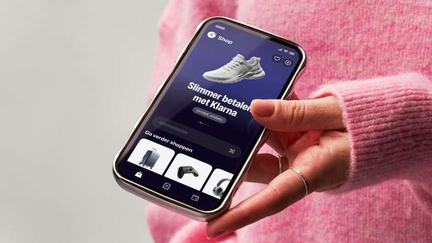
Klarnaのデザインシステムは、洗練されたダークネイビーのプライマリーカラー(#0b051d)を基調とし、シグネチャーであるピンク(#ffa8cd)などの鮮やかなアクセントカラーを組み合わせています。カスタムのKlarnaフォントとシステムフォントを併用し、角丸(最も多いのは32px)を強調しています。また、アクセシビリティに配慮して高いコントラストを維持しています。ゆとりのある余白と明確なタイポグラフィの階層によって、プロフェッショナルさと親しみやすさのバランスを取っている点が特徴です。

Airbnbのデザインシステムは、独自のバリアブルフォント「Airbnb Cereal VF」を中心に構成されています。ほぼモノクロームのニュートラルなパレットで、濃いチャコール(#222222)とライトグレーを基調としています。ブランドのシグネチャーカラーである「Rausch」のコーラルピンク(#ff385c)は、プライマリーCTAとロゴにのみ限定して使われています。レイアウトはレスポンシブな写真カードグリッドで、画像とテキストの比率にゆとりがあります。カードには20pxのやわらかな角丸が付けられ、複数レイヤーのアンビエントシャドウによって、強いコントラストを避けながら控えめな奥行きを生み出しています。検索バーは目立つピル型のコンテナで、主要なユーザーアクションをまとめる役割を果たしています。

IKEAのグローバルホームページは、大胆でフラットなデザインシステムを採用しています。象徴的なIKEAイエロー(#ffdb00)を主要なアクション面として用い、IKEAブルー(#0058a3)をブランドロゴのアクセントカラーとして使用しています。タイポグラフィ全体は、Noto IKEAというカスタムタイプフェイス一種類で構成されており、ウェイトは400と700を使い分けています。本文の14pxからディスプレイ見出しの51pxまで、サイズ展開は細かく定義されています。立体感はシャドウではなく、色のコントラストとレイアウト構造によって表現されています。レイアウトは最大幅90remのコンテナと、デスクトップでは1.5remのグリッドギャップを使用し、インタラクティブな要素には8pxの角丸トークンを一貫して適用しています。オフホワイトの背景(#fffefb)は、濃い#111111のテキストに温かみを添え、コントラストが高く読みやすい体験を実現しています。

Notionのマーケティング向けホームページは、深いネイビー(#02093a)のヒーローセクションと明るい(#f6f5f4)ボディを組み合わせています。全テキストに独自書体のNotionInterを用い、12カラムグリッドと28pxのガターで構成されています。角丸は2種類を使い分け、カードには8px、ピル型の要素には9999pxを適用しています。フローティングUIには複数レイヤーのシャドウを段階的に重ねた影の仕組みを採用しています。ブランドブルー(#2537b1)はCTAやアクセントのハイライトに使われ、gray-200からgray-900までの段階的なグレースケールが、テキストと面の階層を整えています。

Railwayのデザインシステムは、ダークを基調とした開発者向けプラットフォームのUIです。深い黒に近いネイビーの面(#13111c、#0b0b0f)を土台にし、高コントラストのオフホワイトのテキスト(#f7f7f8)と、特徴的な紫のブランドアクセント(#853bce / #553f83)を組み合わせています。ヒーローセクションはIBM Plex Serifで編集的な重みを出し、UIの文言はすべてInterで組み、コード表示にはJetBrains MonoとSF Monoを使っています。 立体感は影ではなく、rgba(255,255,255,0.2) 1.5px insetの白い光彩のような内側ボーダーで表現しており、ガラスパネルのような印象を与えます。スペーシングは4pxを基準とし、8/12/16/24/32の明確なリズムで構成されています。角丸は4pxが中心で、カードやヒーローのコンテナには8pxと16pxを限定的に使っています。