52% match
ghost · desktop
It renders 52% like the site, below the 97% bar.
At rest52% match55 measurements match
Hover52% match18 measurements match
Focus54% match18 measurements match
Extraction confidence
ghost · desktop
It renders 52% like the site, below the 97% bar.
At rest52% match55 measurements match
Hover52% match18 measurements match
Focus54% match18 measurements match
ghost · desktop
It renders 55% like the site, below the 97% bar.
At rest55% match55 measurements match
Hover55% match18 measurements match
Focus54% match18 measurements match
secondary · desktop
It renders 94% like the site, below the 97% bar.
At rest94% match102 measurements match
Hover94% match19 measurements match
Focus94% match19 measurements match
desktop
It renders 9% like the site, below the 96% bar.
At rest9% match262 measurements match
At rest, instance 24% match262 measurements match
At rest, instance 310% match262 measurements match
At rest, instance 45% match262 measurements match
desktop
List height is 0px, the site has 54px; Item width is 0px, the site has 87px and 10 more.
At rest100% match12 of 132 measurements differ
desktop
At rest100% match292 measurements match
desktop
Item width is 0px, the site has 113px.
At rest100% match1 of 231 measurements differ
desktop
Inner y is 30px, the site has 21px; Inner height is 36px, the site has 54px and 6 more.
At rest100% match8 of 164 measurements differ
Focusnot checked
Focus on cta95% match20 measurements match
Focus on logo100% match18 measurements match
mobile
Inner y is 16px, the site has 12px; Inner height is 36px, the site has 44px.
At rest95% match2 of 142 measurements differ
Focusnot checked
Focus on cta88% match20 measurements match
Focus on logo95% match18 measurements match
desktop
Group height is 134px, the site has 732px; Inner height is 0px, the site has 492px and 8 more.
At rest100% match10 of 147 measurements differ
mobile
Group height is 102px, the site has 657px; Inner height is 0px, the site has 145px and 8 more.
At rest100% match10 of 147 measurements differ
desktop
No recipe was made: the element could not be found on the page.
Nothing was compared for this component.
IKEA
IKEA Global reads like a warm, plain-spoken magazine rather than a storefront. The page is an off-white canvas, Warm Canvas (surface, #FFFEFB), carrying full-bleed lifestyle photography of real rooms and people. A single saturated block of IKEA Yellow (primary, #FFDB00) holds the shopping call-to-action. Everything else stays near-black on cream, so the yellow is unmistakable. Headlines are short and conversational ('Welcome to the wild side!'), set heavy and tightly tracked, and they sit over photography rather than in separate text bands.
Density is low and editorial. Large image tiles in a modular two-column feed do most of the talking. Text is confined to an eyebrow line plus a bold headline anchored to the bottom-left of each tile. Chrome is minimal: a cream header with a short text nav, and a long solid-black footer with white links.
Hierarchy comes from three levers: scale (an 82px hero headline down to 13px micro text), weight (only 400 and 700 exist), and color blocking (cream page, yellow CTA panel, black footer). Shadows play no part. Depth comes from photography and from flat color fields.
Key Characteristics:
surface (#FFFEFB) canvas instead of pure white; text is ink (#111111), not pure black.primary IKEA Yellow (#FFDB00), reserved for the shopping CTA block and yellow buttons.Omani Rial falling through to Noto IKEA and Noto Sans, at two weights only: 400 and 700.rounded.md (8px), on image tiles and panels.surface-dark, #000000) footer with on-dark (#FFFFFF) links closes every page.The palette is deliberately small: warm neutrals, one loud brand yellow, and a few functional accents. Most of the page is ink on surface.
primary, #FFDB00): the signature. Use it for the shopping CTA panel and yellow buttons (button-secondary fill). Never use it for body text or large decorative washes beyond the CTA block.primary-tint, #FFF094): the hover fill of yellow buttons (button-secondary hover) and a soft secondary surface.accent-orange, #FFAE66): an occasional promotional or illustrative fill. Keep it rare.success, #1A7E3B): positive or availability actions only. It appears on an interactive element, never as a decorative fill.surface, #FFFEFB): the page background and header fill (header, header-mobile). It is softer than pure white; do not replace it with #FFFFFF for the page.surface-dark, #000000): the full-width footer background (footer, footer-mobile).ink, #111111): default text, headlines and dark button fills (button-ghost).ink-black, #000000): small utility text such as the header skip/CTA link (header-cta).ink-soft, #333333): measured only as the hover fill of the dark button (button-ghost hover). It is a state color, not page text.muted, #818181): secondary metadata and de-emphasized labels, used sparingly.on-primary, #111111): text on yellow.on-dark, #FFFFFF): text and links on the black footer and on photo captions.link, #0000EE): the browser-default link color, measured on the logo link (header-logo). It is not a designed text color; do not style visible links with it.hairline, #DADADA): thin dividers and quiet control outlines, such as the divider above the store selector in the yellow panel.These were measured on recipes rather than in page sampling:
ink-soft (#333333) is the hover fill of button-ghost.button-ghost-2.button-ghost-2.There are no brand gradients. The only gradient-like treatment is a dark scrim at the bottom of photo tiles, observed in the screenshots, that keeps white captions legible. It is an image overlay, not a palette color.
One family does everything. The computed stack is "Omani Rial", "Emirati Dirham", "Saudi Riyal", "Noto IKEA", "Noto Sans JP", "Noto Sans KR", "Noto Sans SC", "Noto Sans TC", "Noto Sans", Roboto, "Open Sans", system-ui, sans-serif. The tokens name it Omani Rial. The leading currency-named faces appear to be glyph-subset fonts, so Latin text effectively renders in Noto IKEA, IKEA's proprietary humanist sans. Headlines, body, navigation, buttons and footer all share it.
| Token | Size | Weight | Line Height | Letter Spacing | Use |
|---|---|---|---|---|---|
hero-display | 82.2857px | 700 | 1.1 | -3.55102px | Single hero headline |
display-lg | 45.7143px | 700 | 1.1 | -1.59184px | Major section headings (h2) |
display-md | 36.5714px | 700 | 1.15 | -1.10204px | Story tile headlines; the most common display size |
display-md-relaxed | 36.5714px | 700 | 1.25 | -1.10204px | Multi-line or linked tile headlines needing more air |
body-lg | 20px | 400 | 1.6 | normal | Lead text and footer navigation links (navigation-2) |
body | 16px | 400 | 1.5 | normal | Default paragraphs, links, list items |
body-strong | 16px | 700 | 1.15 | normal | Inline emphasis, short bold labels |
label-strong | 16px | 700 | 1 | normal | Single-line bold labels inside buttons (button-secondary-label-2) |
button | 16px | 400 | 1 | normal | Primary button labels (button-secondary) |
body-sm | 14px | 400 | 1.55 | normal | Small links, footer legal and meta lists (navigation-3, footer-text) |
button-sm | 14px | 400 | 1.5 | normal | Compact button labels |
caption | 13.7143px | 400 | 1.8 | 0.0612245px | Eyebrows and captions above tile headlines |
micro | 13.3333px | 400 | 1.5 | normal | Small pill/overlay buttons (button-ghost, button-ghost-2) |
normal. caption is the one exception, with a hair of positive tracking.button, label-strong) use 1.Noto IKEA is proprietary. Use Noto Sans as the open-source stand-in; it is already the fallback in IKEA's own stack, so metrics and character are close. Load weights 400 and 700 only. Keep the negative display tracking from the tokens, and check that bold headlines at hero-display do not feel wider than the original; if they do, tighten tracking slightly rather than dropping the size.
No layout measurement was verified. No spacing tokens survived grounding, so there is no base step, no named spacing scale and no section-padding-y. Build spacing on a consistent small increment and keep paddings inside tiles generous and uniform. Treat every value you choose as an assumption to check against the live site.
No container max width or grid gap was verified as a token.
caption eyebrow above a display-md headline.Whitespace is used in big, deliberate gaps: a large empty band separates the hero from the story feed. Inside the feed, gutters stay tight so the photos read as one continuous wall. Keep text off the canvas wherever possible; let images fill tiles edge to edge and place copy on the image over the dark scrim. The cream canvas should feel calm around the photography, never crowded with extra UI.
| Level | Treatment | Use |
|---|---|---|
| Flat | No box-shadow and no backdrop-filter; content sits directly on surface (#FFFEFB) | Page canvas, image tiles (card), header (header), footer (footer) |
| Color block | A solid fill change: primary (#FFDB00) or surface-dark (#000000) | The yellow CTA panel and the black footer, which separate by color rather than lift |
| Hairline | 1px solid borders | button-secondary carries a border-top of 1px solid #FFFEFB; header-cta carries 1px solid #000000 on its right and bottom edges; hairline (#DADADA) dividers inside the yellow panel |
| Image scrim | Dark bottom gradient over photography (observed in screenshots, no measured value) | Legibility for white captions on photo tiles |
Shadow philosophy. The design uses no shadows. No box-shadow or backdrop blur was measured on any recipe or on the page, and the header is fixed without blur. Depth is photographic: the image does the work, and color fields (yellow panel, black footer) create zones without lifting anything. The small solid-black circular arrow and play buttons only look like they float because of contrast, not shadow. When you need separation, reach for a hairline rule or a surface color change, never a drop shadow.
| Token | Value | Use |
|---|---|---|
rounded.md | 8px | Image tiles and their inner image blocks (card-group, card-group-2), the yellow CTA panel, and general containers |
The geometry is soft-rectangular and almost monotone: one radius, applied everywhere a surface has corners. That consistency is the shape language; don't introduce a second rounding step for tiles or panels.
Circles are the one deliberate contrast. Small solid-black circular icon buttons (arrow, play) sit on photography, and a dot-grid motif on one story tile repeats the circle. No circle or pill radius token was measured, so build these as true circles (radius at half the size) and only for icon buttons. Pill shapes are not part of the measured system. The logo's rounded oval is artwork; do not derive a radius from it.
Each component below was distilled from the live page: the recipe is a standalone, placeholder-filled reproduction with literal values, and every frontmatter key named in the anatomy carries the same measurements. A verified component reproduced the original in every check; a flagged one is shipped with the reason it did not; one marked not verifiable could not be compared with the original, which says nothing about the recipe.
Button, secondary
Verification: flagged, the render matched 94% of the original pixels, below the 97% required after 2 correction attempts.
Anatomy
button-secondary: the component root, a <button> (.c-button-secondary)button-secondary-group: inner flex row (.c-button-secondary__group)button-secondary-group-2: inner group (.c-button-secondary__group-2)button-secondary-label: label text, 6 characters (.c-button-secondary__label)button-secondary-label-2: label text, 7 characters (.c-button-secondary__label-2)button-secondary-label-3: label text, 4 characters (.c-button-secondary__label-3)button-secondary-group-3: inner group (.c-button-secondary__group-3)button-secondary-icon: icon placeholder, 16x9px (.c-button-secondary__icon)Recipe
<div class="c-button-secondary-scope">
  <button class="c-button-secondary" type="button">
    <span class="c-button-secondary__group">
      <span class="c-button-secondary__group-2">
        <span class="c-button-secondary__label">lorem</span>
        <span class="c-button-secondary__label-2">lorem i</span>
        <span class="c-button-secondary__label-3">lore</span>
      </span>
      <span class="c-button-secondary__group-3">
        <span class="c-button-secondary__icon" aria-hidden="true"></span>
      </span>
    </span>
  </button>
</div>
.c-button-secondary-scope {
  background-color: #FFDB00;
  color: #111111;
  font-family: "Omani Rial", "Emirati Dirham", "Saudi Riyal", "Noto IKEA", "Noto Sans JP", "Noto Sans KR", "Noto Sans SC", "Noto Sans TC", "Noto Sans", Roboto, "Open Sans", system-ui, sans-serif;
  font-size: 16px;
  font-weight: 400;
  line-height: normal;
}

.c-button-secondary {
  display: inline-block;
  border-spacing: 0px;
  box-sizing: border-box;
  min-height: 100px;
  padding: 16px 50px;
  position: relative;
  z-index: 2;
  background-color: #FFDB00;
  color: #111111;
  cursor: pointer;
  font-family: "Omani Rial", "Emirati Dirham", "Saudi Riyal", "Noto IKEA", "Noto Sans JP", "Noto Sans KR", "Noto Sans SC", "Noto Sans TC", "Noto Sans", Roboto, "Open Sans", system-ui, sans-serif;
  font-size: 16px;
  font-weight: 400;
  line-height: 16px;
  letter-spacing: normal;
  text-transform: none;
  text-align: center;
  transition: background 0.3s ease;
  border-top: 1px solid #FFFEFB;
  border-right: 0;
  border-bottom: 0;
  border-left: 0;
  border-bottom-right-radius: 8px;
  border-bottom-left-radius: 8px;
}

.c-button-secondary__group {
  display: flex;
  align-items: center;
}

.c-button-secondary__group-2 {
  display: block;
  max-width: 70%;
  overflow-x: hidden;
  overflow-y: hidden;
  white-space: nowrap;
  text-overflow: ellipsis;
}

.c-button-secondary__label-2 {
  display: inline;
  font-weight: 700;
}

.c-button-secondary__group-3 {
  display: block;
  max-width: 70%;
  overflow-x: hidden;
  overflow-y: hidden;
  white-space: nowrap;
  text-overflow: ellipsis;
  margin-right: 8px;
  margin-left: auto;
}

.c-button-secondary__icon {
  display: block;
  flex-shrink: 0;
  width: 16px;
  height: 9px;
  overflow-x: hidden;
  overflow-y: hidden;
  background-color: currentcolor;
  transform: matrix(-1, 0, 0, -1, 0, 0);
  transition: transform 0.3s ease;
}

.c-button-secondary:hover {
  background-color: #FFF094;
}

.c-button-secondary:focus {
  outline: none;
}

.c-button-secondary:focus::before {
  content: "";
  display: block;
  width: 451px;
  height: 99px;
  position: absolute;
  top: 0px;
  right: 0px;
  bottom: 0px;
  left: 0px;
  z-index: 100;
  box-shadow: #111111 0px 0px 0px 1px inset, #FFFFFF 0px 0px 0px 3px inset, #111111 0px 0px 0px 4px inset;
}
States
button-secondary-hover): background-color #FFF094Button, ghost
Verification: flagged, the render matched 52% of the original pixels, below the 97% required after 2 correction attempts.
Anatomy
button-ghost: the component root, a <button> (.c-button-ghost)button-ghost-group: inner flex row (.c-button-ghost__group)button-ghost-icon: icon placeholder, 12x14px (.c-button-ghost__icon)button-ghost-label: label text, 81 characters (.c-button-ghost__label)Recipe
<div class="c-button-ghost-scope">
  <button class="c-button-ghost" type="button">
    <div class="c-button-ghost__group">
      <span class="c-button-ghost__icon" aria-hidden="true"></span>
      <span class="c-button-ghost__label">lorem ipsum dolor sit amet consectetur adipiscing elit sed do eiusmod tempor lore</span>
    </div>
  </button>
</div>
.c-button-ghost-scope {
  background-color: #FFFEFB;
  color: #111111;
  font-family: "Omani Rial", "Emirati Dirham", "Saudi Riyal", "Noto IKEA", "Noto Sans JP", "Noto Sans KR", "Noto Sans SC", "Noto Sans TC", "Noto Sans", Roboto, "Open Sans", system-ui, sans-serif;
  font-size: 16px;
  font-weight: 400;
  line-height: 0px;
}

.c-button-ghost {
  display: block;
  justify-content: center;
  align-items: center;
  border-spacing: 0px;
  box-sizing: border-box;
  width: 56px;
  height: 56px;
  padding: 0px;
  position: absolute;
  right: 24px;
  bottom: 24px;
  z-index: 10;
  background-color: #111111;
  color: #FFFFFF;
  border: 0;
  border-radius: 50%;
  cursor: pointer;
  font-family: "Omani Rial", "Emirati Dirham", "Saudi Riyal", "Noto IKEA", "Noto Sans JP", "Noto Sans KR", "Noto Sans SC", "Noto Sans TC", "Noto Sans", Roboto, "Open Sans", system-ui, sans-serif;
  font-size: 13.3333px;
  font-weight: 400;
  line-height: normal;
  letter-spacing: normal;
  text-transform: none;
  text-align: center;
}

.c-button-ghost__group {
  display: flex;
  justify-content: center;
  align-items: center;
}

.c-button-ghost__icon {
  display: block;
  flex-shrink: 0;
  width: 12px;
  height: 14px;
  overflow-x: hidden;
  overflow-y: hidden;
  background-color: currentcolor;
  margin-left: 2px;
}

.c-button-ghost__label {
  display: block;
  width: 1px;
  height: 1px;
  position: absolute;
  overflow-x: hidden;
  overflow-y: hidden;
  white-space: nowrap;
}

.c-button-ghost:hover {
  background-color: #333333;
}

.c-button-ghost:focus {
  outline: none;
}

.c-button-ghost:focus::before {
  content: "";
  display: block;
  width: 56px;
  height: 56px;
  position: absolute;
  top: 0px;
  right: 0px;
  bottom: 0px;
  left: 0px;
  z-index: 100;
  border-radius: 50%;
  box-shadow: #111111 0px 0px 0px 1px inset, #FFFFFF 0px 0px 0px 3px inset, #111111 0px 0px 0px 4px inset;
}
States
button-ghost-hover): background-color #333333Button, ghost (2)
Verification: flagged, the render matched 55% of the original pixels, below the 97% required after 2 correction attempts.
Anatomy
button-ghost-2: the component root, a <button> (.c-button-ghost-2)button-ghost-2-group: inner flex row (.c-button-ghost-2__group)button-ghost-2-icon: icon placeholder, 12x14px (.c-button-ghost-2__icon)button-ghost-2-label: label text, 67 characters (.c-button-ghost-2__label)Recipe
<div class="c-button-ghost-2-scope">
  <button class="c-button-ghost-2" type="button">
    <div class="c-button-ghost-2__group">
      <span class="c-button-ghost-2__icon" aria-hidden="true"></span>
      <span class="c-button-ghost-2__label">lorem ipsum dolor sit amet consectetur adipiscing elit sed do eiusm</span>
    </div>
  </button>
</div>
.c-button-ghost-2-scope {
  background-color: #FFFEFB;
  color: #111111;
  font-family: "Omani Rial", "Emirati Dirham", "Saudi Riyal", "Noto IKEA", "Noto Sans JP", "Noto Sans KR", "Noto Sans SC", "Noto Sans TC", "Noto Sans", Roboto, "Open Sans", system-ui, sans-serif;
  font-size: 16px;
  font-weight: 400;
  line-height: 0px;
}

.c-button-ghost-2 {
  display: block;
  justify-content: center;
  align-items: center;
  border-spacing: 0px;
  box-sizing: border-box;
  width: 56px;
  height: 56px;
  padding: 0px;
  position: absolute;
  right: 24px;
  bottom: 24px;
  z-index: 10;
  background-color: #FFFFFF;
  color: #111111;
  border: 0;
  border-radius: 50%;
  cursor: pointer;
  font-family: "Omani Rial", "Emirati Dirham", "Saudi Riyal", "Noto IKEA", "Noto Sans JP", "Noto Sans KR", "Noto Sans SC", "Noto Sans TC", "Noto Sans", Roboto, "Open Sans", system-ui, sans-serif;
  font-size: 13.3333px;
  font-weight: 400;
  line-height: normal;
  letter-spacing: normal;
  text-transform: none;
  text-align: center;
}

.c-button-ghost-2__group {
  display: flex;
  justify-content: center;
  align-items: center;
}

.c-button-ghost-2__icon {
  display: block;
  flex-shrink: 0;
  width: 12px;
  height: 14px;
  overflow-x: hidden;
  overflow-y: hidden;
  background-color: currentcolor;
  margin-left: 2px;
}

.c-button-ghost-2__label {
  display: block;
  width: 1px;
  height: 1px;
  position: absolute;
  overflow-x: hidden;
  overflow-y: hidden;
  white-space: nowrap;
}

.c-button-ghost-2:hover {
  background-color: #F5F5F5;
}

.c-button-ghost-2:focus {
  outline: none;
}

.c-button-ghost-2:focus::before {
  content: "";
  display: block;
  width: 56px;
  height: 56px;
  position: absolute;
  top: 0px;
  right: 0px;
  bottom: 0px;
  left: 0px;
  z-index: 100;
  border-radius: 50%;
  box-shadow: #111111 0px 0px 0px 1px inset, #FFFFFF 0px 0px 0px 3px inset, #111111 0px 0px 0px 4px inset;
}
States
button-ghost-2-hover): background-color #F5F5F5Verification: flagged, the render matched 9% of the original pixels, below the 96% required (instance 1) after 2 correction attempts.
Anatomy
card: the component root, a <div> (.c-card)card-group: inner block (.c-card__group, 2 instances)card-group-2: inner block (.c-card__group-2, 2 instances)card-link: link (.c-card__link)card-group-3: inner block (.c-card__group-3, 2 instances), content not capturedcard-group-4: inner block (.c-card__group-4, 2 instances), content not capturedcard-link-2: link (.c-card__link-2)card-group-5: inner block (.c-card__group-5)Recipe
<div class="c-card-scope">
  <div class="c-card">
    <div class="c-card__group">
      <div class="c-card__group-2">
        <a class="c-card__link" href="#">
          <div class="c-card__group-3"></div>
        </a>
        <div class="c-card__group-4"></div>
      </div>
    </div>
    <div class="c-card__group">
      <div class="c-card__group-2">
        <a class="c-card__link-2" href="#">
          <div class="c-card__group-3"></div>
        </a>
        <div class="c-card__group-4"></div>
        <div class="c-card__group-5"></div>
      </div>
    </div>
  </div>
</div>
.c-card-scope {
  background-color: #FFFEFB;
  color: #111111;
  font-family: "Omani Rial", "Emirati Dirham", "Saudi Riyal", "Noto IKEA", "Noto Sans JP", "Noto Sans KR", "Noto Sans SC", "Noto Sans TC", "Noto Sans", Roboto, "Open Sans", system-ui, sans-serif;
  font-size: 16px;
  font-weight: 400;
  line-height: normal;
}

.c-card {
  display: inline-grid;
  gap: 20px;
  grid-template-columns: 1fr 1fr;
  grid-template-rows: auto;
  border-spacing: 0px;
  color: #111111;
  font-family: "Omani Rial", "Emirati Dirham", "Saudi Riyal", "Noto IKEA", "Noto Sans JP", "Noto Sans KR", "Noto Sans SC", "Noto Sans TC", "Noto Sans", Roboto, "Open Sans", system-ui, sans-serif;
  font-size: 16px;
  font-weight: 400;
  line-height: normal;
}

.c-card__group {
  display: block;
  overflow-x: hidden;
  overflow-y: hidden;
  border-radius: 8px;
}

.c-card__group-2 {
  display: block;
  width: 100%;
  height: 684px;
  position: relative;
  overflow-x: hidden;
  overflow-y: hidden;
  border-radius: 8px;
  cursor: pointer;
}

.c-card__link {
  display: flex;
  flex-direction: column;
  justify-content: end;
  box-sizing: border-box;
  width: 100%;
  padding: 24px;
  position: absolute;
  top: 0px;
  right: 0px;
  bottom: 0px;
  left: 0px;
  z-index: 1;
  cursor: pointer;
  text-decoration-line: none;
}

.c-card__group-3 {
  display: block;
  position: relative;
}

.c-card__group-4 {
  display: block;
  position: absolute;
  top: 0px;
  right: 0px;
  bottom: 0px;
  left: 0px;
}

.c-card__link-2 {
  display: flex;
  flex-direction: column;
  justify-content: end;
  box-sizing: border-box;
  width: 100%;
  padding: 24px;
  position: absolute;
  top: 0px;
  right: 0px;
  bottom: 0px;
  left: 0px;
  z-index: 1;
  color: #FFFFFF;
  cursor: pointer;
  text-decoration-line: none;
}

.c-card__group-5 {
  display: block;
  width: 100%;
  height: 100%;
  position: absolute;
  bottom: 0px;
  left: 0px;
  z-index: 0;
  background-image: linear-gradient(to top, #0000008C 80px, transparent 200px);
}
States
Navigation
Verification: flagged, the navigation-list height did not reproduce the measured 54px after 2 correction attempts.
Anatomy
navigation: the component root, a <nav> (.c-navigation)navigation-list: inner flex row (.c-navigation__list)navigation-item: inner group (.c-navigation__item, 4 instances)Recipe
<div class="c-navigation-scope">
  <nav class="c-navigation">
    <ul class="c-navigation__list">
      <li class="c-navigation__item"></li>
      <li class="c-navigation__item"></li>
      <li class="c-navigation__item"></li>
      <li class="c-navigation__item"></li>
    </ul>
  </nav>
</div>
.c-navigation-scope {
  background-color: #FFFEFB;
  color: #111111;
  font-family: "Omani Rial", "Emirati Dirham", "Saudi Riyal", "Noto IKEA", "Noto Sans JP", "Noto Sans KR", "Noto Sans SC", "Noto Sans TC", "Noto Sans", Roboto, "Open Sans", system-ui, sans-serif;
  font-size: 16px;
  font-weight: 400;
  line-height: normal;
}

.c-navigation {
  display: block;
  border-spacing: 0px;
  color: #111111;
  font-family: "Omani Rial", "Emirati Dirham", "Saudi Riyal", "Noto IKEA", "Noto Sans JP", "Noto Sans KR", "Noto Sans SC", "Noto Sans TC", "Noto Sans", Roboto, "Open Sans", system-ui, sans-serif;
  font-size: 16px;
  font-weight: 400;
  line-height: normal;
}

.c-navigation__list {
  display: flex;
  padding: 0px;
  margin: 0px;
  list-style-type: none;
}

.c-navigation__item {
  display: list-item;
}
States
Navigation (2)
Verification: verified against the live page at desktop.
Anatomy
navigation-2: the component root, a <nav> (.c-navigation-2)navigation-2-list: inner flex row (.c-navigation-2__list)navigation-2-item: inner group (.c-navigation-2__item, 6 instances)navigation-2-link: link, 19-character label (.c-navigation-2__link, 6 instances)navigation-2-item-2: label text, 1 characters (.c-navigation-2__item-2, 5 instances)Recipe
<div class="c-navigation-2-scope">
  <nav class="c-navigation-2">
    <ul class="c-navigation-2__list">
      <li class="c-navigation-2__item">
        <a class="c-navigation-2__link" href="#">lorem ipsum dolor s</a>
      </li>
      <li class="c-navigation-2__item-2">l</li>
      <li class="c-navigation-2__item">
        <a class="c-navigation-2__link" href="#">lorem ipsum dolo</a>
      </li>
      <li class="c-navigation-2__item-2">l</li>
      <li class="c-navigation-2__item">
        <a class="c-navigation-2__link" href="#">lorem ipsum dol</a>
      </li>
      <li class="c-navigation-2__item-2">l</li>
      <li class="c-navigation-2__item">
        <a class="c-navigation-2__link" href="#">lorem ipsum</a>
      </li>
      <li class="c-navigation-2__item-2">l</li>
      <li class="c-navigation-2__item">
        <a class="c-navigation-2__link" href="#">lorem ipsum dolor sit amet c</a>
      </li>
      <li class="c-navigation-2__item-2">l</li>
      <li class="c-navigation-2__item">
        <a class="c-navigation-2__link" href="#">lore</a>
      </li>
    </ul>
  </nav>
</div>
.c-navigation-2-scope {
  background-color: #000000;
  color: #FFFFFF;
  font-family: "Omani Rial", "Emirati Dirham", "Saudi Riyal", "Noto IKEA", "Noto Sans JP", "Noto Sans KR", "Noto Sans SC", "Noto Sans TC", "Noto Sans", Roboto, "Open Sans", system-ui, sans-serif;
  font-size: 20px;
  font-weight: 400;
  line-height: 32.4px;
}

.c-navigation-2 {
  display: block;
  border-spacing: 0px;
  color: #FFFFFF;
  font-family: "Omani Rial", "Emirati Dirham", "Saudi Riyal", "Noto IKEA", "Noto Sans JP", "Noto Sans KR", "Noto Sans SC", "Noto Sans TC", "Noto Sans", Roboto, "Open Sans", system-ui, sans-serif;
  font-size: 20px;
  font-weight: 400;
  line-height: 32.4px;
}

.c-navigation-2__list {
  display: flex;
  flex-wrap: wrap;
  justify-content: center;
  padding: 0px;
  margin: 16px 0px 36px;
  list-style-type: none;
}

.c-navigation-2__item {
  display: list-item;
}

.c-navigation-2__link {
  display: inline;
  position: relative;
  color: #FFFFFF;
  cursor: pointer;
  text-decoration-line: none;
}

.c-navigation-2__item-2 {
  display: block;
  margin-right: 24px;
  margin-left: 24px;
}
States
Navigation (3)
Verification: flagged, the navigation-3-item width did not reproduce the measured 113px after 2 correction attempts.
Anatomy
navigation-3: the component root, a <nav> (.c-navigation-3)navigation-3-list: inner flex row (.c-navigation-3__list)navigation-3-item: inner group (.c-navigation-3__item, 5 instances)navigation-3-item-2: label text, 1 characters (.c-navigation-3__item-2, 4 instances)navigation-3-link: link, 26-character label (.c-navigation-3__link, 4 instances)Recipe
<div class="c-navigation-3-scope">
  <nav class="c-navigation-3">
    <ul class="c-navigation-3__list">
      <li class="c-navigation-3__item"></li>
      <li class="c-navigation-3__item-2">l</li>
      <li class="c-navigation-3__item">
        <a class="c-navigation-3__link" href="#">lorem ipsum dolor sit amet</a>
      </li>
      <li class="c-navigation-3__item-2">l</li>
      <li class="c-navigation-3__item">
        <a class="c-navigation-3__link" href="#">lorem ipsum dolor sit amet cons</a>
      </li>
      <li class="c-navigation-3__item-2">l</li>
      <li class="c-navigation-3__item">
        <a class="c-navigation-3__link" href="#">lorem i</a>
      </li>
      <li class="c-navigation-3__item-2">l</li>
      <li class="c-navigation-3__item">
        <a class="c-navigation-3__link" href="#">lorem</a>
      </li>
    </ul>
  </nav>
</div>
.c-navigation-3-scope {
  background-color: #000000;
  color: #FFFFFF;
  font-family: "Omani Rial", "Emirati Dirham", "Saudi Riyal", "Noto IKEA", "Noto Sans JP", "Noto Sans KR", "Noto Sans SC", "Noto Sans TC", "Noto Sans", Roboto, "Open Sans", system-ui, sans-serif;
  font-size: 14px;
  font-weight: 400;
  line-height: 21.98px;
}

.c-navigation-3 {
  display: block;
  border-spacing: 0px;
  color: #FFFFFF;
  font-family: "Omani Rial", "Emirati Dirham", "Saudi Riyal", "Noto IKEA", "Noto Sans JP", "Noto Sans KR", "Noto Sans SC", "Noto Sans TC", "Noto Sans", Roboto, "Open Sans", system-ui, sans-serif;
  font-size: 14px;
  font-weight: 400;
  line-height: 21.98px;
}

.c-navigation-3__list {
  display: flex;
  flex-wrap: wrap;
  justify-content: center;
  padding: 0px;
  margin: 16px 0px 0px;
  list-style-type: none;
}

.c-navigation-3__item {
  display: list-item;
}

.c-navigation-3__item-2 {
  display: block;
  margin-right: 20px;
  margin-left: 20px;
}

.c-navigation-3__link {
  display: inline;
  position: relative;
  color: #FFFFFF;
  cursor: pointer;
  text-decoration-line: none;
}
States
Verification: desktop flagged, the header-inner y did not reproduce the measured 21px after 2 correction attempts; mobile flagged, the header-mobile-inner y did not reproduce the measured 12px after 2 correction attempts.
Anatomy
header: the component root, a <header> (.c-header)header-group: inner flex row (.c-header__group)header-cta: link, 20-character label (.c-header__cta)header-inner: inner flex row (.c-header__inner)header-group-2: inner flex row (.c-header__group-2)header-logo: link (.c-header__logo)header-logo-image: image placeholder, 89x36px (.c-header__logo-image)header-group-3: inner block (.c-header__group-3)Desktop recipe
<div class="c-header-scope">
  <header class="c-header">
    <div class="c-header__group">
      <a class="c-header__cta" href="#">lorem ipsum dolor si</a>
    </div>
    <div class="c-header__inner">
      <div class="c-header__group-2">
        <a class="c-header__logo" href="#">
          <span class="c-header__logo-image" aria-hidden="true"></span>
        </a>
        <div class="c-header__group-3"></div>
      </div>
    </div>
  </header>
</div>
.c-header-scope {
  background-color: #FFFEFB;
  color: #111111;
  font-family: "Omani Rial", "Emirati Dirham", "Saudi Riyal", "Noto IKEA", "Noto Sans JP", "Noto Sans KR", "Noto Sans SC", "Noto Sans TC", "Noto Sans", Roboto, "Open Sans", system-ui, sans-serif;
  font-size: 16px;
  font-weight: 400;
  line-height: normal;
}

.c-header {
  display: flex;
  flex-direction: column;
  align-items: center;
  border-spacing: 0px;
  box-sizing: border-box;
  height: 96px;
  position: fixed;
  top: 0px;
  z-index: 11;
  background-color: #FFFEFB;
  color: #111111;
  transform: matrix(1, 0, 0, 1, 0, -96);
  font-family: "Omani Rial", "Emirati Dirham", "Saudi Riyal", "Noto IKEA", "Noto Sans JP", "Noto Sans KR", "Noto Sans SC", "Noto Sans TC", "Noto Sans", Roboto, "Open Sans", system-ui, sans-serif;
  font-size: 16px;
  font-weight: 400;
  line-height: normal;
  transition: transform 0.15s cubic-bezier(1, 0.26, 0.51, 0.72);
}

.c-header__group {
  display: flex;
  justify-content: left;
  width: 100%;
  position: fixed;
  top: -200px;
  transition: transform 0.2s ease;
}

.c-header__cta {
  display: block;
  padding: 20px;
  position: relative;
  background-color: #FFFEFB;
  color: #000000;
  cursor: pointer;
  text-decoration-line: underline;
  text-decoration-color: #000000;
  border-right-width: 1px;
  border-bottom-width: 1px;
  border-right-style: solid;
  border-bottom-style: solid;
  border-right-color: #000000;
  border-bottom-color: #000000;
}

.c-header__inner {
  display: flex;
  justify-content: space-between;
  align-items: center;
  box-sizing: border-box;
  width: 100%;
  max-width: 1440px;
  margin: auto;
  position: relative;
  padding-right: 24px;
  padding-left: 24px;
}

.c-header__group-2 {
  display: flex;
  align-items: center;
}

.c-header__logo {
  display: block;
  position: relative;
  color: #0000EE;
  cursor: pointer;
  text-decoration-line: underline;
  text-decoration-color: #0000EE;
}

.c-header__logo-image {
  display: block;
  flex-shrink: 0;
  width: 89px;
  height: 36px;
  aspect-ratio: auto 88.641 / 36;
  overflow-x: clip;
  overflow-y: clip;
  background-color: currentcolor;
}

.c-header__group-3 {
  display: block;
  flex-grow: 1;
  flex-basis: 0%;
  margin-left: 16px;
}

.c-header__cta:focus {
  outline: none;
}

.c-header__cta:focus::before {
  content: "";
  display: block;
  width: 195px;
  height: 62px;
  position: absolute;
  top: 0px;
  right: 0px;
  bottom: 0px;
  left: 0px;
  z-index: 100;
  box-shadow: #111111 0px 0px 0px 1px inset, #FFFFFF 0px 0px 0px 3px inset, #111111 0px 0px 0px 4px inset;
}

.c-header__logo:focus {
  outline: none;
}

.c-header__logo:focus::before {
  content: "";
  display: block;
  width: 89px;
  height: 36px;
  position: absolute;
  top: 0px;
  right: 0px;
  bottom: 0px;
  left: 0px;
  z-index: 100;
  box-shadow: #111111 0px 0px 0px 1px inset, #FFFFFF 0px 0px 0px 3px inset, #111111 0px 0px 0px 4px inset;
}
Mobile anatomy
header-mobile: the component root, a <header> (.c-header-mobile)header-mobile-group: inner flex row (.c-header-mobile__group)header-mobile-cta: link, 20-character label (.c-header-mobile__cta)header-mobile-inner: inner flex row (.c-header-mobile__inner)header-mobile-group-2: inner flex row (.c-header-mobile__group-2)header-mobile-logo: link (.c-header-mobile__logo)header-mobile-logo-image: image placeholder, 89x36px (.c-header-mobile__logo-image)Mobile recipe
<div class="c-header-mobile-scope">
  <header class="c-header-mobile">
    <div class="c-header-mobile__group">
      <a class="c-header-mobile__cta" href="#">lorem ipsum dolor si</a>
    </div>
    <div class="c-header-mobile__inner">
      <div class="c-header-mobile__group-2">
        <a class="c-header-mobile__logo" href="#">
          <span class="c-header-mobile__logo-image" aria-hidden="true"></span>
        </a>
      </div>
    </div>
  </header>
</div>
.c-header-mobile-scope {
  background-color: #FFFEFB;
  color: #111111;
  font-family: "Omani Rial", "Emirati Dirham", "Saudi Riyal", "Noto IKEA", "Noto Sans JP", "Noto Sans KR", "Noto Sans SC", "Noto Sans TC", "Noto Sans", Roboto, "Open Sans", system-ui, sans-serif;
  font-size: 16px;
  font-weight: 400;
  line-height: normal;
}

.c-header-mobile {
  display: flex;
  flex-direction: column;
  align-items: center;
  border-spacing: 0px;
  box-sizing: border-box;
  height: 68px;
  position: fixed;
  top: 0px;
  z-index: 11;
  background-color: #FFFEFB;
  color: #111111;
  font-family: "Omani Rial", "Emirati Dirham", "Saudi Riyal", "Noto IKEA", "Noto Sans JP", "Noto Sans KR", "Noto Sans SC", "Noto Sans TC", "Noto Sans", Roboto, "Open Sans", system-ui, sans-serif;
  font-size: 16px;
  font-weight: 400;
  line-height: normal;
  transition: transform 0.15s cubic-bezier(1, 0.26, 0.51, 0.72);
}

.c-header-mobile__group {
  display: flex;
  justify-content: left;
  width: 100%;
  position: fixed;
  top: -200px;
  transition: transform 0.2s ease;
}

.c-header-mobile__cta {
  display: block;
  padding: 20px;
  position: relative;
  background-color: #FFFEFB;
  color: #000000;
  cursor: pointer;
  text-decoration-line: underline;
  text-decoration-color: #000000;
  border-right-width: 1px;
  border-bottom-width: 1px;
  border-right-style: solid;
  border-bottom-style: solid;
  border-right-color: #000000;
  border-bottom-color: #000000;
}

.c-header-mobile__inner {
  display: flex;
  justify-content: space-between;
  align-items: center;
  box-sizing: border-box;
  width: 100%;
  max-width: 1440px;
  margin: auto;
  position: relative;
  padding-right: 16px;
  padding-left: 16px;
}

.c-header-mobile__group-2 {
  display: flex;
  align-items: center;
}

.c-header-mobile__logo {
  display: block;
  position: relative;
  color: #0000EE;
  cursor: pointer;
  text-decoration-line: underline;
  text-decoration-color: #0000EE;
}

.c-header-mobile__logo-image {
  display: block;
  flex-shrink: 0;
  width: 89px;
  height: 36px;
  aspect-ratio: auto 88.641 / 36;
  overflow-x: clip;
  overflow-y: clip;
  background-color: currentcolor;
}

.c-header-mobile__cta:focus {
  outline: none;
}

.c-header-mobile__cta:focus::before {
  content: "";
  display: block;
  width: 195px;
  height: 62px;
  position: absolute;
  top: 0px;
  right: 0px;
  bottom: 0px;
  left: 0px;
  z-index: 100;
  box-shadow: #111111 0px 0px 0px 1px inset, #FFFFFF 0px 0px 0px 3px inset, #111111 0px 0px 0px 4px inset;
}

.c-header-mobile__logo:focus {
  outline: none;
}

.c-header-mobile__logo:focus::before {
  content: "";
  display: block;
  width: 89px;
  height: 36px;
  position: absolute;
  top: 0px;
  right: 0px;
  bottom: 0px;
  left: 0px;
  z-index: 100;
  box-shadow: #111111 0px 0px 0px 1px inset, #FFFFFF 0px 0px 0px 3px inset, #111111 0px 0px 0px 4px inset;
}
States
header-cta focus: outline none, ::before content "", ::before display block, ::before width 195px, ::before height 62px, ::before position absolute, ::before top 0px, ::before right 0px, ::before bottom 0px, ::before left 0px, ::before z-index 100, ::before box-shadow #111111 0px 0px 0px 1px inset, #FFFFFF 0px 0px 0px 3px inset, #111111 0px 0px 0px 4px insetheader-logo focus: outline none, ::before content "", ::before display block, ::before width 89px, ::before height 36px, ::before position absolute, ::before top 0px, ::before right 0px, ::before bottom 0px, ::before left 0px, ::before z-index 100, ::before box-shadow #111111 0px 0px 0px 1px inset, #FFFFFF 0px 0px 0px 3px inset, #111111 0px 0px 0px 4px insetheader-mobile-cta focus: outline none, ::before content "", ::before display block, ::before width 195px, ::before height 62px, ::before position absolute, ::before top 0px, ::before right 0px, ::before bottom 0px, ::before left 0px, ::before z-index 100, ::before box-shadow #111111 0px 0px 0px 1px inset, #FFFFFF 0px 0px 0px 3px inset, #111111 0px 0px 0px 4px insetheader-mobile-logo focus: outline none, ::before content "", ::before display block, ::before width 89px, ::before height 36px, ::before position absolute, ::before top 0px, ::before right 0px, ::before bottom 0px, ::before left 0px, ::before z-index 100, ::before box-shadow #111111 0px 0px 0px 1px inset, #FFFFFF 0px 0px 0px 3px inset, #111111 0px 0px 0px 4px insetVerification: desktop flagged, the footer-group height did not reproduce the measured 732px after 2 correction attempts; mobile flagged, the footer-mobile-group height did not reproduce the measured 657px after 2 correction attempts.
Anatomy
footer: the component root, a <footer> (.c-footer)footer-group: inner block (.c-footer__group)footer-inner: inner block (.c-footer__inner)footer-group-2: inner block (.c-footer__group-2)footer-group-3: inner block (.c-footer__group-3)footer-group-4: inner block (.c-footer__group-4)footer-group-5: inner flex row (.c-footer__group-5)footer-text: label text, 37 characters (.c-footer__text)Desktop recipe
<div class="c-footer-scope">
  <footer class="c-footer">
    <div class="c-footer__group">
      <div class="c-footer__inner"></div>
      <div class="c-footer__group-2">
        <div class="c-footer__group-3"></div>
        <div class="c-footer__group-4"></div>
        <div class="c-footer__group-5">
          <span class="c-footer__text">lorem ipsum dolor sit amet consectetu</span>
        </div>
      </div>
    </div>
  </footer>
</div>
.c-footer-scope {
  background-color: #FFFEFB;
  color: #111111;
  font-family: "Omani Rial", "Emirati Dirham", "Saudi Riyal", "Noto IKEA", "Noto Sans JP", "Noto Sans KR", "Noto Sans SC", "Noto Sans TC", "Noto Sans", Roboto, "Open Sans", system-ui, sans-serif;
  font-size: 16px;
  font-weight: 400;
  line-height: normal;
}

.c-footer {
  display: block;
  border-spacing: 0px;
  box-sizing: border-box;
  position: relative;
  overflow-x: hidden;
  overflow-y: hidden;
  background-color: #000000;
  color: #111111;
  font-family: "Omani Rial", "Emirati Dirham", "Saudi Riyal", "Noto IKEA", "Noto Sans JP", "Noto Sans KR", "Noto Sans SC", "Noto Sans TC", "Noto Sans", Roboto, "Open Sans", system-ui, sans-serif;
  font-size: 16px;
  font-weight: 400;
  line-height: normal;
  padding-top: 140px;
  padding-right: 24px;
  padding-left: 24px;
}

.c-footer__group {
  display: block;
  transform: matrix(1, 0, 0, 1, 0, 0);
  transform-origin: 696px 366.164px;
}

.c-footer__inner {
  display: block;
  max-width: 1211px;
  margin: auto;
}

.c-footer__group-2 {
  display: block;
  color: #FFFFFF;
  padding-top: 80px;
  padding-bottom: 16px;
}

.c-footer__group-3 {
  display: block;
  font-size: 20px;
  line-height: 32.4px;
  margin-top: 16px;
  margin-bottom: 16px;
}

.c-footer__group-4 {
  display: block;
  opacity: 0.6;
  font-size: 14px;
  line-height: 21.98px;
}

.c-footer__group-5 {
  display: flex;
  justify-content: center;
  opacity: 0.6;
  font-size: 14px;
  line-height: 21.98px;
  margin-top: 16px;
}

.c-footer__text {
  display: block;
}
Mobile anatomy
footer-mobile: the component root, a <footer> (.c-footer-mobile)footer-mobile-group: inner block (.c-footer-mobile__group)footer-mobile-inner: inner block (.c-footer-mobile__inner)footer-mobile-group-2: inner block (.c-footer-mobile__group-2)footer-mobile-group-3: inner block (.c-footer-mobile__group-3)footer-mobile-group-4: inner block (.c-footer-mobile__group-4)footer-mobile-group-5: inner flex row (.c-footer-mobile__group-5)footer-mobile-text: label text, 37 characters (.c-footer-mobile__text)Mobile recipe
<div class="c-footer-mobile-scope">
  <footer class="c-footer-mobile">
    <div class="c-footer-mobile__group">
      <div class="c-footer-mobile__inner"></div>
      <div class="c-footer-mobile__group-2">
        <div class="c-footer-mobile__group-3"></div>
        <div class="c-footer-mobile__group-4"></div>
        <div class="c-footer-mobile__group-5">
          <span class="c-footer-mobile__text">lorem ipsum dolor sit amet consectetu</span>
        </div>
      </div>
    </div>
  </footer>
</div>
.c-footer-mobile-scope {
  background-color: #FFFEFB;
  color: #111111;
  font-family: "Omani Rial", "Emirati Dirham", "Saudi Riyal", "Noto IKEA", "Noto Sans JP", "Noto Sans KR", "Noto Sans SC", "Noto Sans TC", "Noto Sans", Roboto, "Open Sans", system-ui, sans-serif;
  font-size: 16px;
  font-weight: 400;
  line-height: normal;
}

.c-footer-mobile {
  display: block;
  border-spacing: 0px;
  box-sizing: border-box;
  position: relative;
  overflow-x: hidden;
  overflow-y: hidden;
  background-color: #000000;
  color: #111111;
  font-family: "Omani Rial", "Emirati Dirham", "Saudi Riyal", "Noto IKEA", "Noto Sans JP", "Noto Sans KR", "Noto Sans SC", "Noto Sans TC", "Noto Sans", Roboto, "Open Sans", system-ui, sans-serif;
  font-size: 16px;
  font-weight: 400;
  line-height: normal;
  padding-top: 80px;
  padding-right: 16px;
  padding-left: 16px;
}

.c-footer-mobile__group {
  display: block;
}

.c-footer-mobile__inner {
  display: block;
  max-width: 794px;
  margin: auto;
}

.c-footer-mobile__group-2 {
  display: block;
  color: #FFFFFF;
  padding-top: 48px;
  padding-bottom: 16px;
}

.c-footer-mobile__group-3 {
  display: block;
  line-height: 25.92px;
  margin-top: 16px;
  margin-bottom: 16px;
}

.c-footer-mobile__group-4 {
  display: block;
  opacity: 0.6;
  font-size: 14px;
  line-height: 21.98px;
}

.c-footer-mobile__group-5 {
  display: flex;
  justify-content: center;
  opacity: 0.6;
  font-size: 14px;
  line-height: 21.98px;
  margin-top: 16px;
}

.c-footer-mobile__text {
  display: block;
}
States
surface (#FFFEFB) with ink (#111111) text; the warm off-white is part of the brand voice.primary (#FFDB00) for the shopping CTA block and yellow buttons. The site fills button-secondary with it, puts on-primary (#111111) text on top, and hovers to primary-tint (#FFF094).button-ghost is ink (#111111) with on-dark text and hovers to ink-soft (#333333). Its white twin button-ghost-2 hovers to #F5F5F5. Both are 56px tall.rounded.md (8px), on every tile and panel, as card-group does.Omani Rial / Noto IKEA stack at weights 400 and 700 only.hero-display, display-lg and display-md to every headline at 36px and above.surface-dark (#000000) footer and on-dark links, set at body-lg for primary links and body-sm for legal links (navigation-2, navigation-3).caption eyebrow above a display-md headline.card, header and footer carry none).rounded.md, apart from true circles on small icon buttons.link (#0000EE) for visible links; it is a browser default measured on the logo link only.primary across backgrounds, borders or text. Its rarity is what makes the CTA land.success (#1A7E3B) or accent-orange (#FFAE66) as general decoration; green signals availability or positive actions, orange is an occasional promo fill.surface for pure #FFFFFF on the page canvas, or ink for pure black in body text.This analysis is two-viewport (one desktop, one mobile capture). No breakpoint values could be observed.
header is 96px tall; the mobile header-mobile is 68px. Both keep the 89×36px logo (header-logo-image, header-mobile-logo-image) and the surface fill. On mobile, the text nav collapses behind a hamburger.card recipe was captured as 4 instances in a 1-column grid with a 20px gap.footer is 872px tall on desktop and footer-mobile is 737px. Both keep the black fill and white body-sm text (footer-text, footer-mobile-text).The overlay buttons button-ghost and button-ghost-2 measure 56px tall, which is comfortably touch-sized. The header-cta link carries 20px padding on all sides. Keep any new tappable control at or above the 56px button height on mobile.
Intermediate tablet layouts, the exact collapse point and type scaling between viewports were not captured. Display sizes are recorded from desktop only.
primary, surface, ink, surface-dark, on-dark and the rest by name. If a color you need is not a token (such as the #F5F5F5 hover on button-ghost-2), keep it scoped to that component's state.primary belongs to the shopping CTA panel and yellow buttons (button-secondary). Adding it elsewhere breaks the system's single focal point. Its hover is always primary-tint.Omani Rial / Noto IKEA, weights are 400 and 700 only, and the radius is rounded.md (8px). Treat all three as fixed boundaries; propose new values only with live-site evidence.hero-display through micro) and keep each token's own line-height and tracking. Do not round the fractional display sizes, and do not apply negative tracking below display-md.surface → primary → surface-dark) or a 1px hairline (hairline), never box-shadow or blur.button-secondary (yellow), button-ghost (dark) and button-ghost-2 (white). Note that most recipes are flagged, so re-check their geometry before you derive new components from them.button-secondary (flagged: the render matched 94% of the original pixels, below the 97% required after 2 correction attempts)button-ghost (flagged: the render matched 52% of the original pixels, below the 97% required after 2 correction attempts)button-ghost-2 (flagged: the render matched 55% of the original pixels, below the 97% required after 2 correction attempts)card (flagged: the render matched 9% of the original pixels, below the 96% required (instance 1) after 2 correction attempts)navigation (flagged: the navigation-list height did not reproduce the measured 54px after 2 correction attempts)navigation-3 (flagged: the navigation-3-item width did not reproduce the measured 113px after 2 correction attempts)header (flagged: the header-inner y did not reproduce the measured 21px after 2 correction attempts)footer (flagged: the footer-group height did not reproduce the measured 732px after 2 correction attempts)header-mobile (flagged: the header-mobile-inner y did not reproduce the measured 12px after 2 correction attempts)footer-mobile (flagged: the footer-mobile-group height did not reproduce the measured 657px after 2 correction attempts)navigation-2 verified.card (card-group-3, card-group-4) were not captured, so tile caption internals are inferred from screenshots.success control's full styling, are unknown.Omani Rial as the family, but that is likely a currency-glyph subset font; the Noto IKEA attribution is inferred from the stack.Extracted from IKEA’s public website, not official brand guidelines. Check another site’s fonts
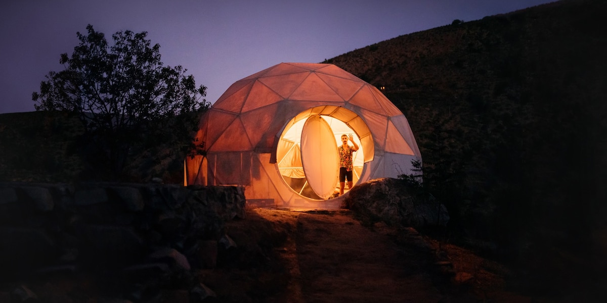
Airbnb's design system is built around a single proprietary variable font (Airbnb Cereal VF), a near-monochrome neutral palette anchored by deep charcoal (#222222) and light grays, with the brand's signature "Rausch" coral-pink (#ff385c) reserved exclusively for primary CTAs and the logo. The layout is a responsive photo-card grid with generous image-to-text ratios, soft 20px rounded corners on cards, and a multi-layer ambient shadow system that creates subtle depth without harsh contrast. The search bar is a prominent pill-shaped container that unifies the core user action.
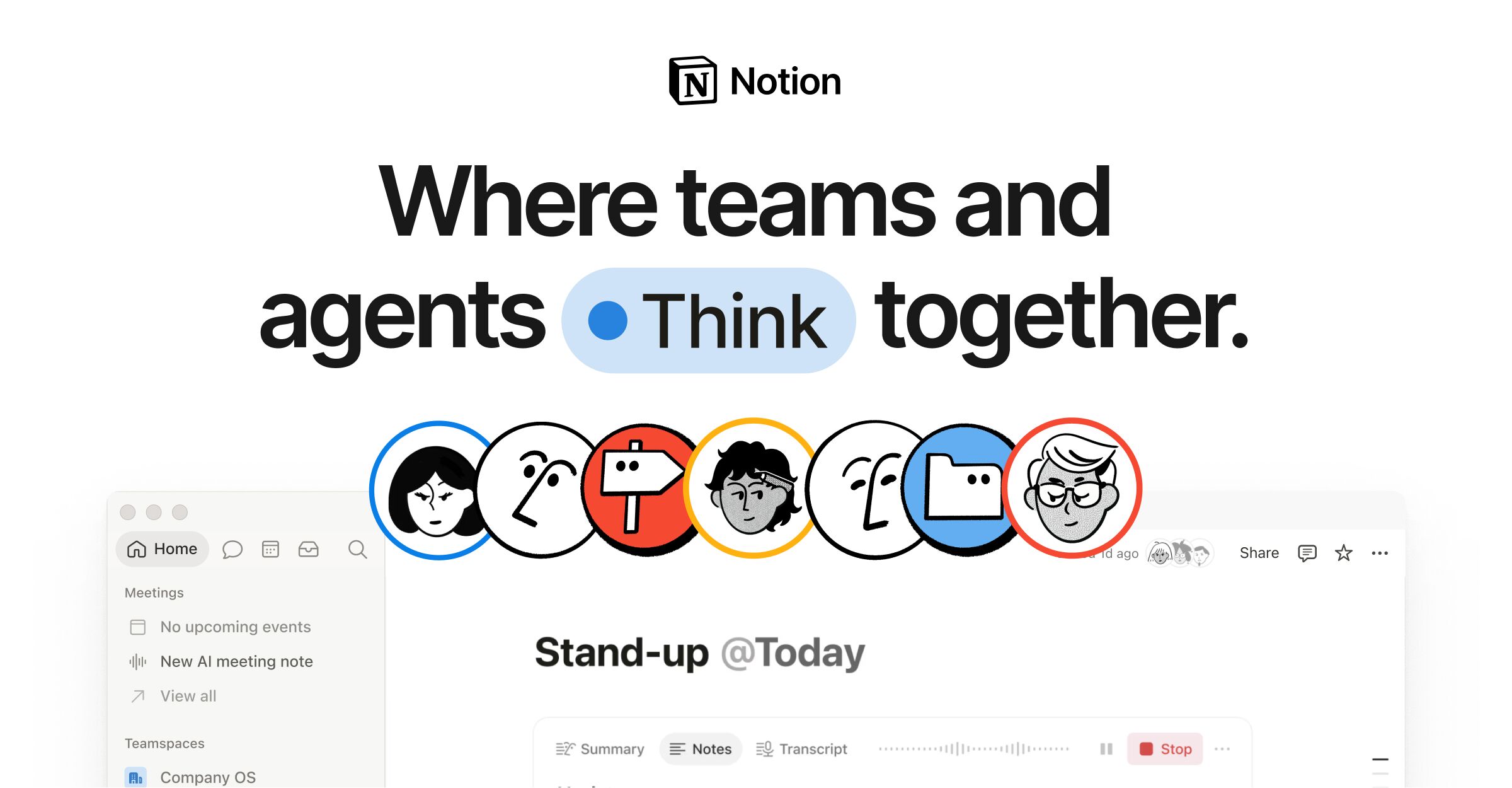
Notion's marketing homepage pairs a deep navy (#02093a) hero section with a light (#f6f5f4) body, using a custom typeface (NotionInter) across all text roles. The design employs a 12-column grid with 28px gutters, a dual-radius language (8px for cards, 9999px for pills), and a multi-layer progressive shadow system for floating UI elements. Brand blue (#2537b1) drives CTAs and accent highlights, while a semantic gray-scale ladder (gray-200 through gray-900) structures all text and surface hierarchy.
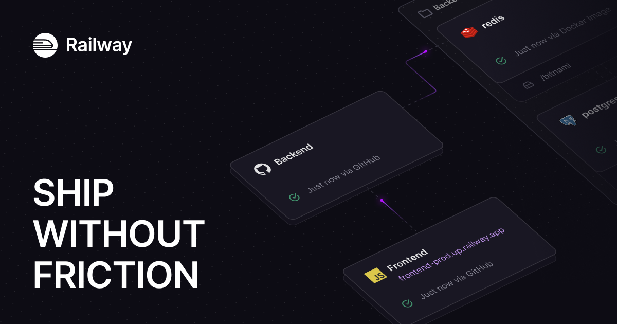
Railway's design system is a dark-first developer platform UI anchored in deep near-black navy surfaces (#13111c, #0b0b0f), high-contrast off-white text (#f7f7f8), and a distinctive purple brand accent (#853bce / #553f83). The hero uses IBM Plex Serif for editorial weight, while Inter handles all UI copy and JetBrains Mono / SF Mono serve code contexts. Elevation is achieved through inset white-glow borders (rgba(255,255,255,0.2) 1.5px inset) rather than drop shadows, giving the UI a glass-panel aesthetic. The spacing system is 4px-based with a strong 8/12/16/24/32 rhythm. Border radii are tight (4px dominant) with selective 8px and 16px for cards and hero containers.

Shopify's marketing homepage uses a dramatic full-bleed video hero with a near-black (#02090a) background that contrasts sharply with the white navigation bar above. The primary brand accent is a vivid mint green (#36f4a4) used sparingly for highlights and interactive states. Typography is split between NeueHaasGrotesk for display/editorial headings and Inter-Variable for UI body copy. CTAs use fully-rounded pill shapes (border-radius: 9999px). The overall system is confident, high-contrast, and aspirational — built to convert visitors into merchants.
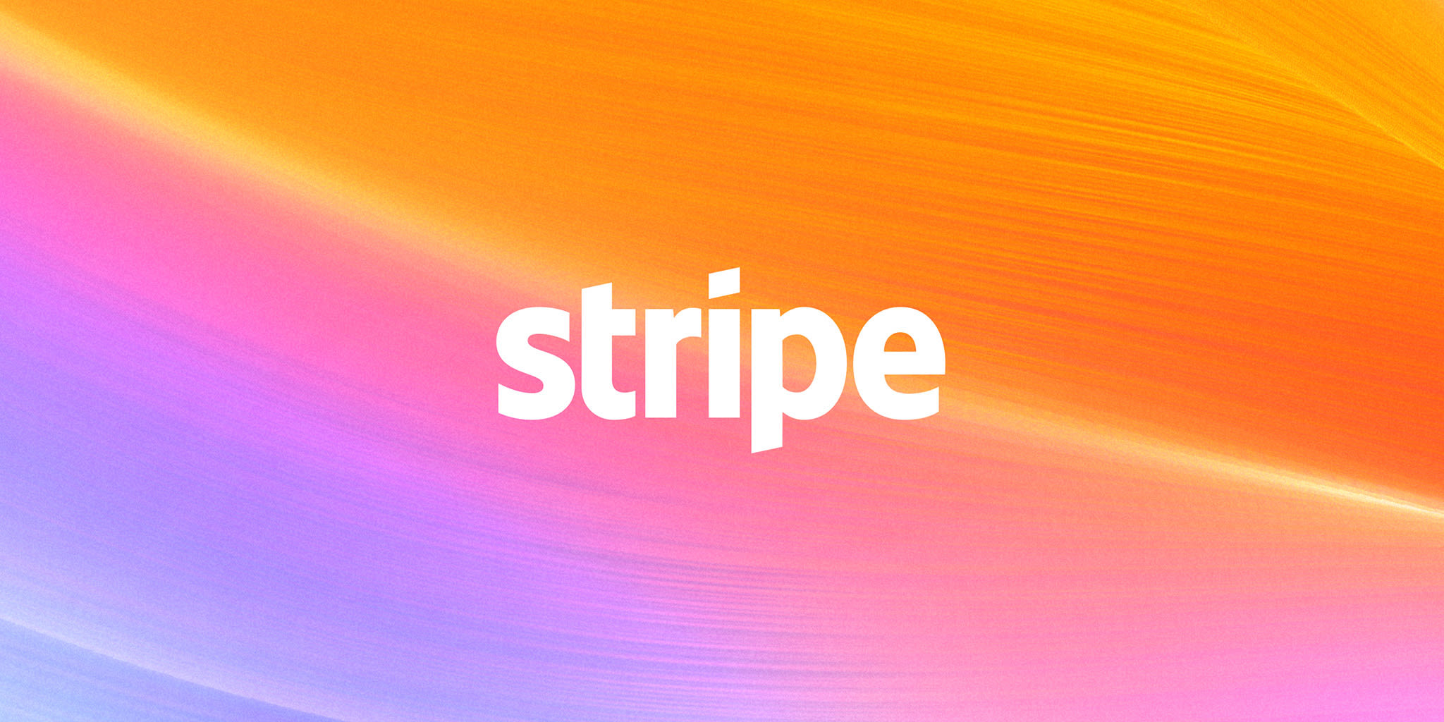
Stripe's marketing homepage uses a tightly controlled design system (HDS — Stripe Design System) built around the variable font "sohne-var" at light weights (300–400), a deep navy-to-indigo brand palette anchored by #533afd (Stripe Indigo), and a signature full-bleed spectral gradient hero. Components are low-radius (4–6px), flat-to-minimal-shadow, and structured around an 8px base spacing grid. The overall tone is authoritative yet approachable — financial infrastructure communicated through confident typography and restrained color use.

Anthropic's design system is a restrained, typographically-led identity built around two custom typefaces — Anthropic Serif and Anthropic Sans — set against a warm ivory background (#faf9f5). The palette is deliberately minimal: near-black (#141413) on warm off-white, with muted stone tones for secondary text and borders. Large-scale serif display type anchors the editorial voice, while a dark-panel section (near-black background with ivory text) creates dramatic contrast. The overall aesthetic communicates intellectual seriousness and safety-first mission through generous whitespace, high typographic contrast, and zero decorative ornamentation.