Developer tool design systems
Design systems extracted from developer tool and infrastructure websites: hosting, databases, APIs, IDEs and DevOps products. Many lean on dark surfaces, monospace accents and code blocks styled as first-class components, with tight, technical typography.
3 DESIGN.md examples in this category, from Neon, Railway and Supabase. Extracted from each site’s public pages, not official brand guidelines. New to the format? Read what a DESIGN.md is.
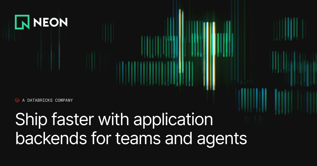
Neon
Neon's design system is a dark-first developer brand built on a near-black canvas (#000000, #18191b) with a vivid neon-green primary (#00e599) and a supporting mid-green (#34d59a). The typographic system pairs Inter (UI/body) with GeistMono (code/data), both with tight negative letter-spacing. Spacing follows a 4px base grid. Border radius is uniformly minimal at 4px. Elevation is achieved through border contrast rather than shadows, with a single ambient drop-shadow used sparingly. The hero section features a full-bleed animated data-visualization background, reinforcing the database/infrastructure brand identity.
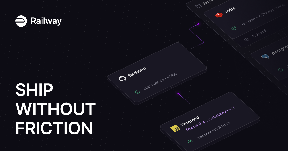
Railway
Railway's design system is a dark-first developer platform UI anchored in deep near-black navy surfaces (#13111c, #0b0b0f), high-contrast off-white text (#f7f7f8), and a distinctive purple brand accent (#853bce / #553f83). The hero uses IBM Plex Serif for editorial weight, while Inter handles all UI copy and JetBrains Mono / SF Mono serve code contexts. Elevation is achieved through inset white-glow borders (rgba(255,255,255,0.2) 1.5px inset) rather than drop shadows, giving the UI a glass-panel aesthetic. The spacing system is 4px-based with a strong 8/12/16/24/32 rhythm. Border radii are tight (4px dominant) with selective 8px and 16px for cards and hero containers.
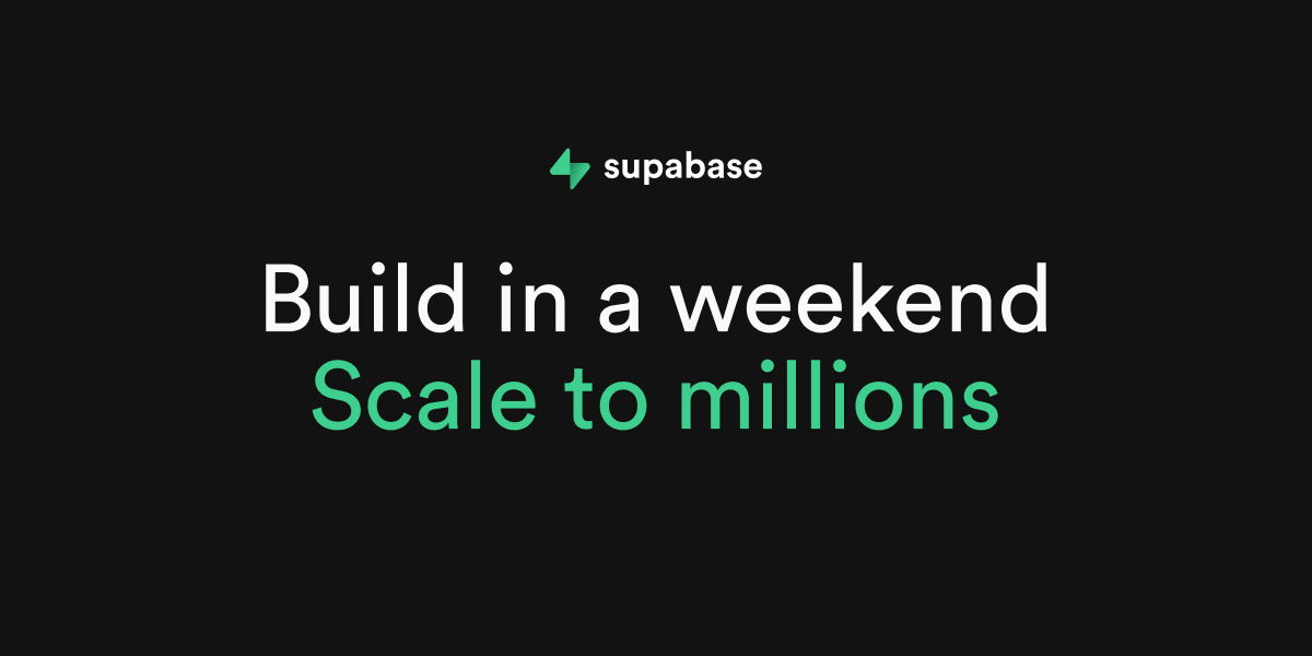
Supabase
Supabase uses a dark-first design system anchored by a deep near-black background (oklch ~0.19) with a vivid green brand accent (#3ecf8e / #3fcf8e). The layout is structured around a responsive feature card grid, with Manrope for display headings and Inter for body/UI text. Source Code Pro handles all monospace/code contexts. The color system is built on oklch custom properties with semantic naming. Cards use 12px radius with subtle border treatment, buttons use 6–8px radius, and the overall density is moderate with an 8px base spacing grid.
Don’t see the site you need?
Paste any URL to get a DESIGN.md from any website. Colors, typography, spacing, and tokens, ready for your AI workflow.