SaaS design systems
Design systems extracted from software and SaaS websites: productivity apps, project tools, CRMs and other products sold as a service. Most pair a restrained palette and one accent color with a clear type scale, which makes them a good starting point for a dashboard or a product marketing page.
3 DESIGN.md examples in this category, from Figma, Linear and Notion. Extracted from each site’s public pages, not official brand guidelines. New to the format? Read what a DESIGN.md is.
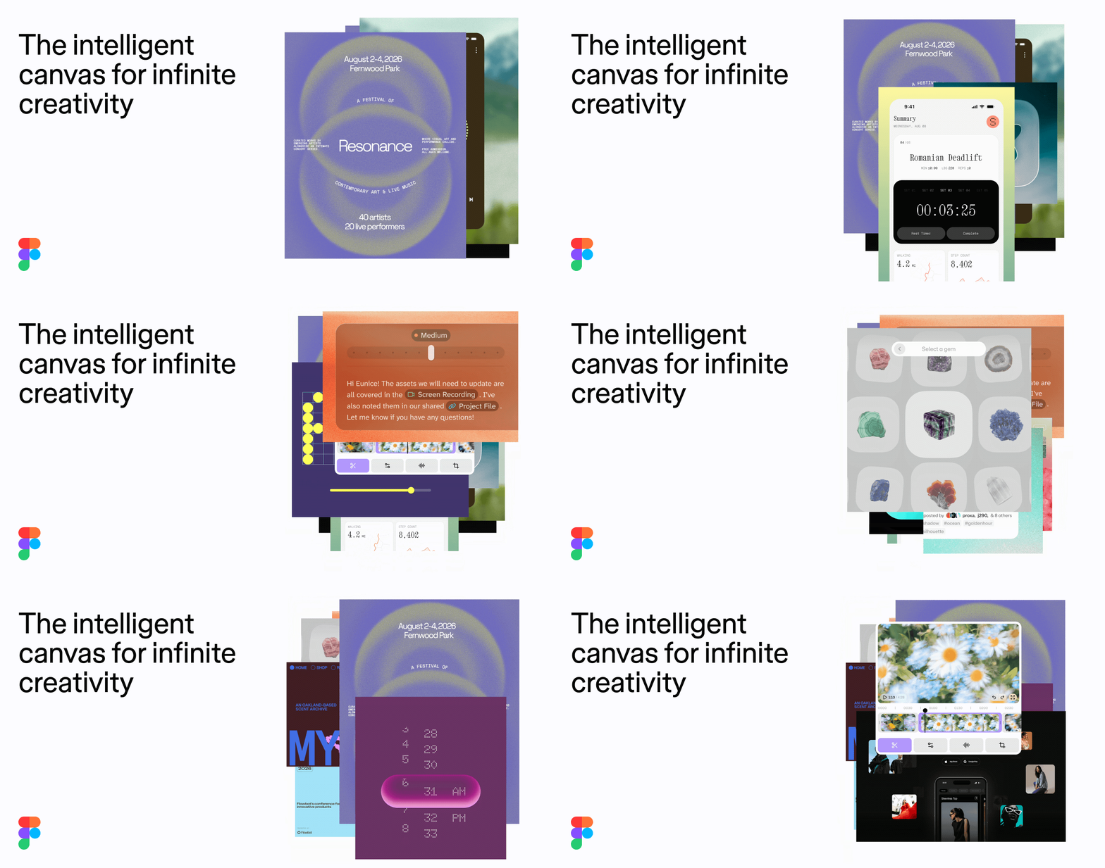
Figma
Figma's marketing site uses a stark black-and-white monochrome system anchored by its proprietary figmaSans variable font. The design is typographically driven — large display headings at 88px/56px with tight negative letter-spacing contrast against lightweight body copy at weight 330. CTAs use fully-rounded pill shapes (border-radius: 9999px) in solid black with white text. The layout is grid-based with a 1440px max-content width, generous 80px vertical section padding, and a clean white canvas. Depth is minimal — shadows are subtle oklch-based overlays. A lavender/purple accent (#cb9fd2) appears in the footer banner. The overall aesthetic is confident, typographically sophisticated, and brand-forward.
Linear
Linear's design system is a dark-first, high-density product UI built for engineering teams. The surface palette anchors on near-black (#08090a, #0f1011) with layered dark grays for sidebar, card, and panel differentiation. Typography is exclusively Inter Variable with precise negative letter-spacing at display sizes and Berkeley Mono for inline code. The radius language is deliberately small (2–6px dominant) with pill shapes reserved for badges and status chips. Elevation is expressed through subtle 1px inset borders and low-opacity drop shadows rather than dramatic layering. The primary CTA color is Linear's signature indigo (#5e6ad2), used on the Sign Up button and key links.
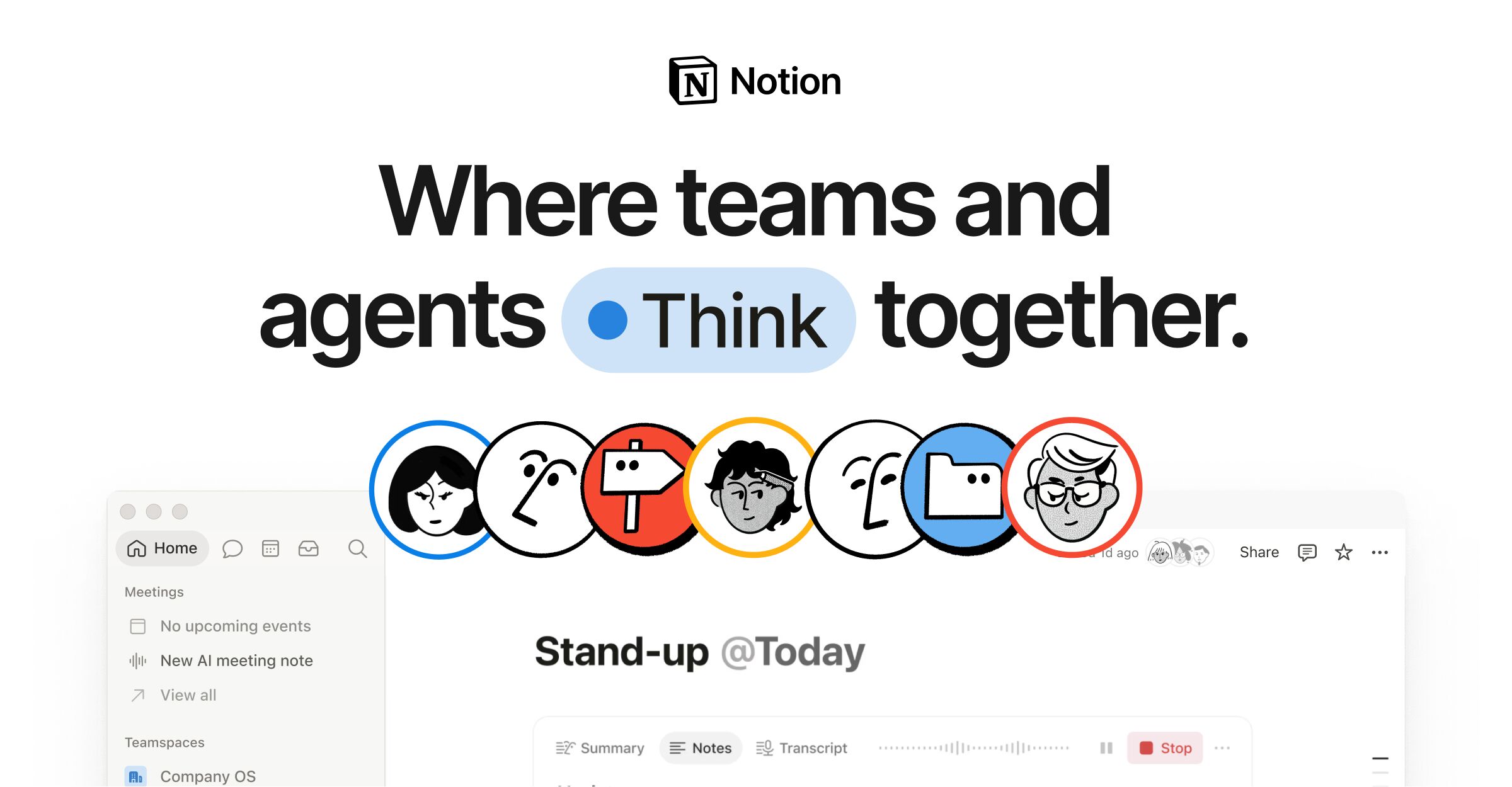
Notion
Notion's marketing homepage pairs a deep navy (#02093a) hero section with a light (#f6f5f4) body, using a custom typeface (NotionInter) across all text roles. The design employs a 12-column grid with 28px gutters, a dual-radius language (8px for cards, 9999px for pills), and a multi-layer progressive shadow system for floating UI elements. Brand blue (#2537b1) drives CTAs and accent highlights, while a semantic gray-scale ladder (gray-200 through gray-900) structures all text and surface hierarchy.
Don’t see the site you need?
Paste any URL to get a DESIGN.md from any website. Colors, typography, spacing, and tokens, ready for your AI workflow.